Trail Town Pale Ale
Can Label, Poster, Billboard
Art Direction
Packaging Design
Trademark Design
My brand concept for the Dayton Beer Company’s “Trail Town Pale Ale” embraces the joys of exploring nature. I envisioned the “Trail Town” as a mystical place beyond the pines that can only be reached by the most adventurous hikers. The packaging and campaign visuals utilize vibrant colors and psychedelic themes that blur the line between reality and imagination.
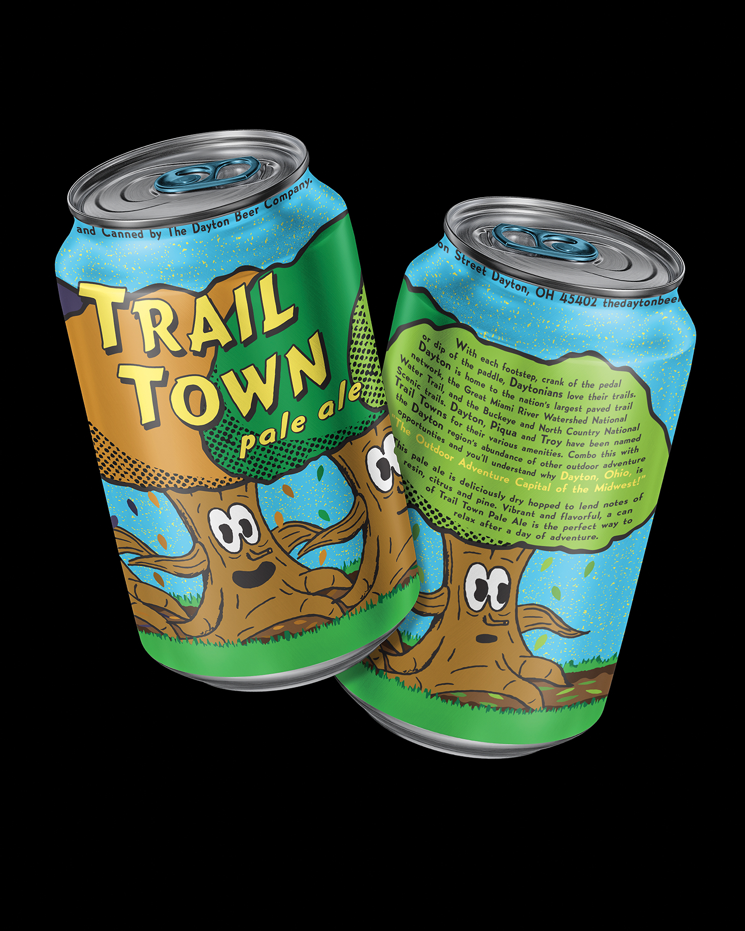
Trail Town Pale Ale can mockups.
This project was the first time I leaned on hand illustration in my design work. In order to set the right tone for the brand I needed the organic imperfection of hand work. I drew from 1970s cartoons in my exploration of characters. I began with a pencil sketch of my tree trunk character and scanned it to do some further refining in Photoshop before converting it to vector.
Choosing a bright color palette was important in creating a can that would grab shoppers’ attention at the grocery store. Bold blue, greens, and yellow reference nature in a way that sticks out on a shelf. The entire brand is meant to be playful, free, and casual. The theme of the wilderness takes a mysterious turn, using urban legends and alternate realities to interest the consumer. Using found security footage and psychedelic visuals, I was able to blur the line between fantasy and reality.

A Trail Town promotional poster using chromatic abberation to create a pychedelic effect.
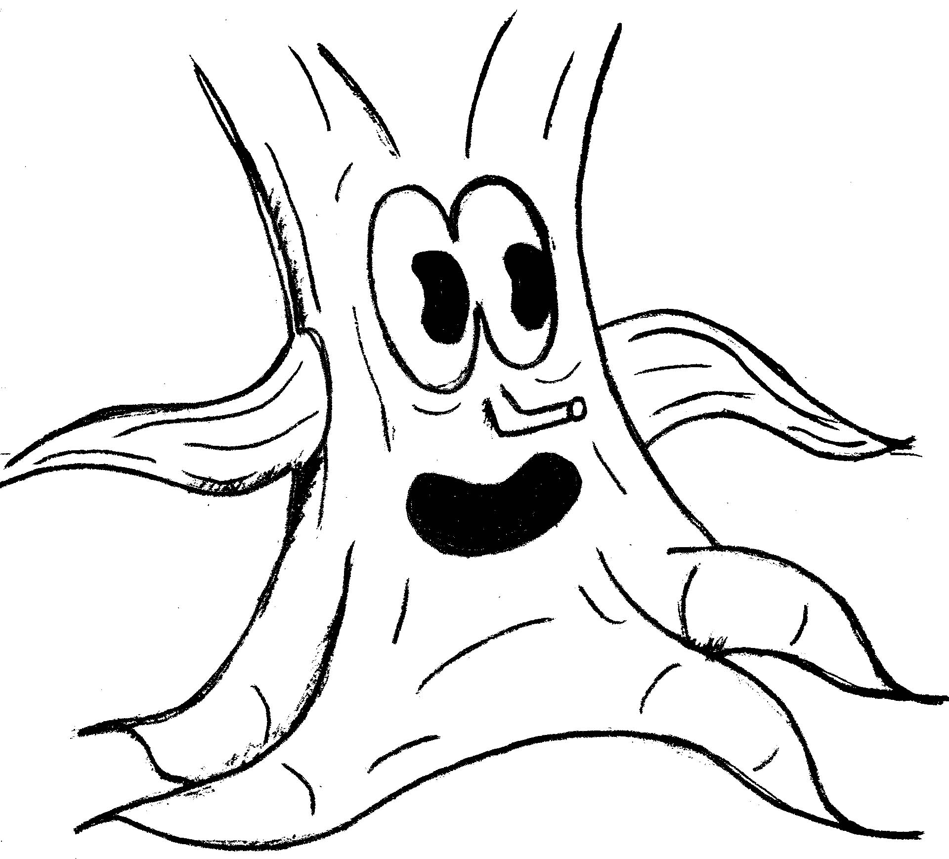
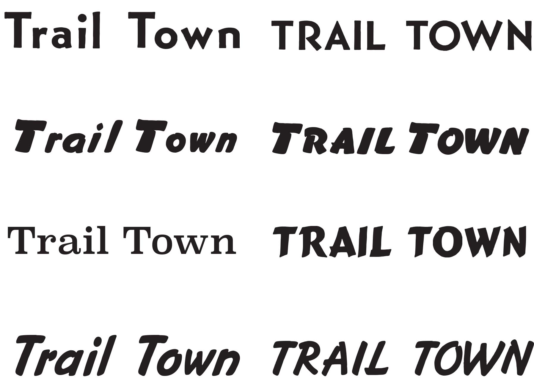
A preliminary pencil sketch and type explorations for the Trail Town brand.
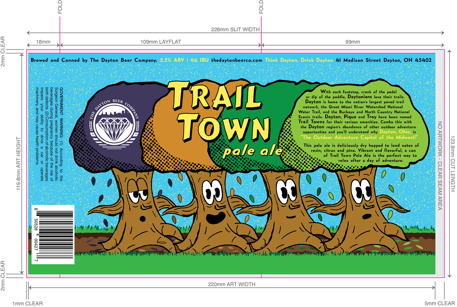
The flat Trail Town label shown in the context of the production template it was built for.
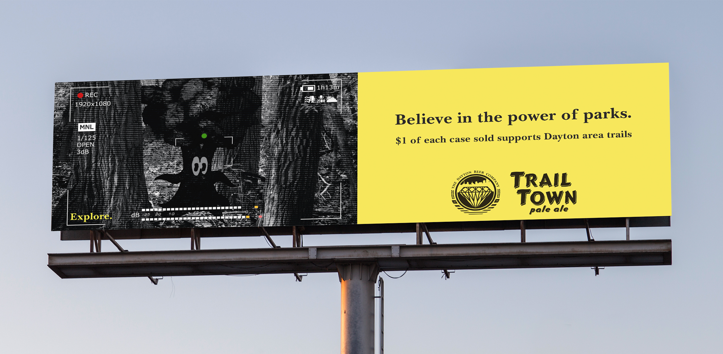
A Trail Town billboard ad featuring a “found footage” motif.