Space Crafted
Logos, Truck, Menu, Shirt, Hat, Coffee Bags, Mobile App
Art DirectionApparel Design
Brand Design
Copy Writing
Trademark Design
Space Crafted is a conceptual brand centered around a mobile coffee bar. The food truck style coffee bar, nicknamed the “Coffee Cruiser,” is a complete brand exploration that features a primary logo, several alternate logo lockups, a truck design, a menu, coffee cups and mugs, coffee bags, and merchandise such as t-shirts and beanies. Customers can find the truck’s location, menu items, and merch on the Space Crafted mobile app.

The Space Crafted truck viewed from the street
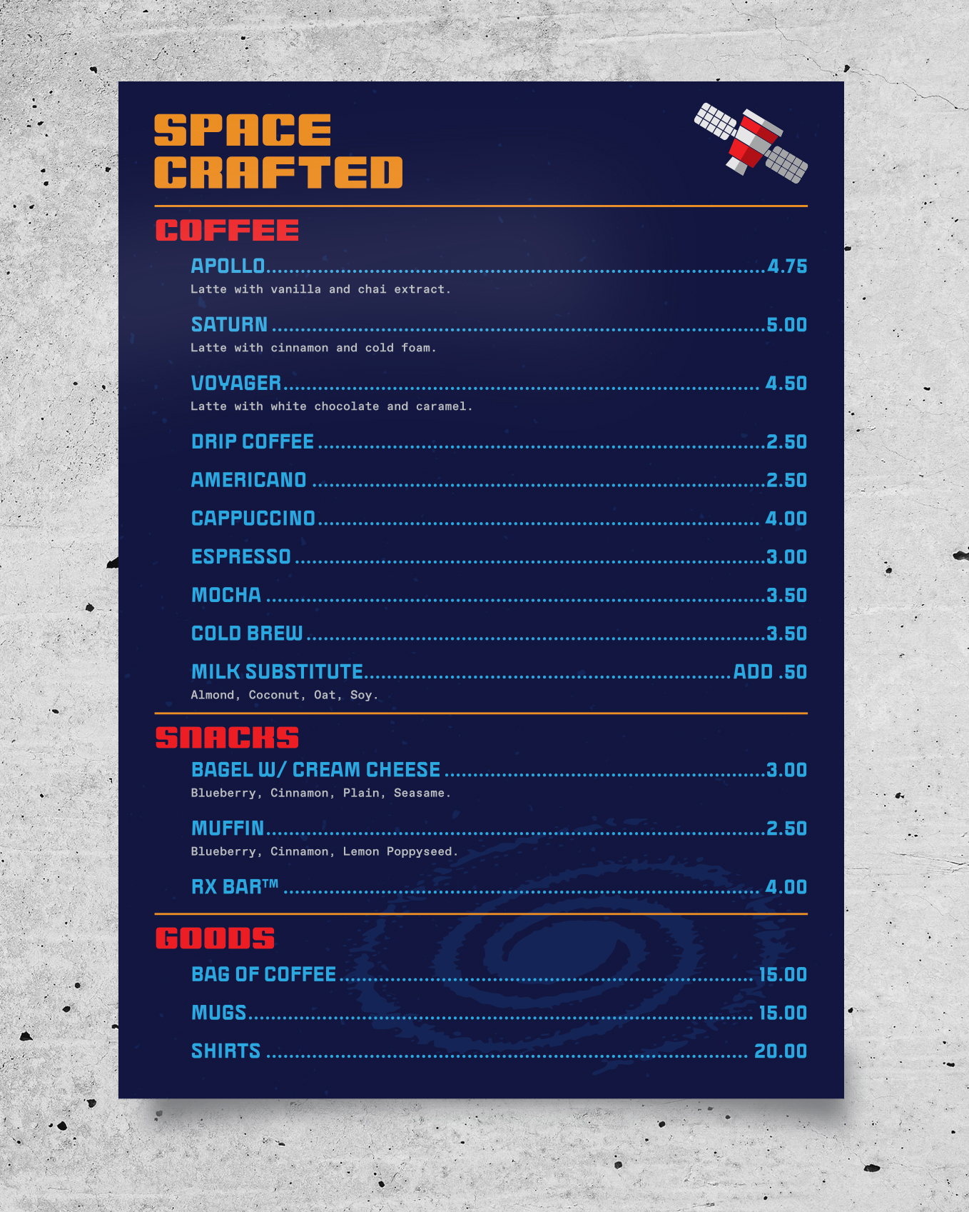
The Space Crafted paper menu.
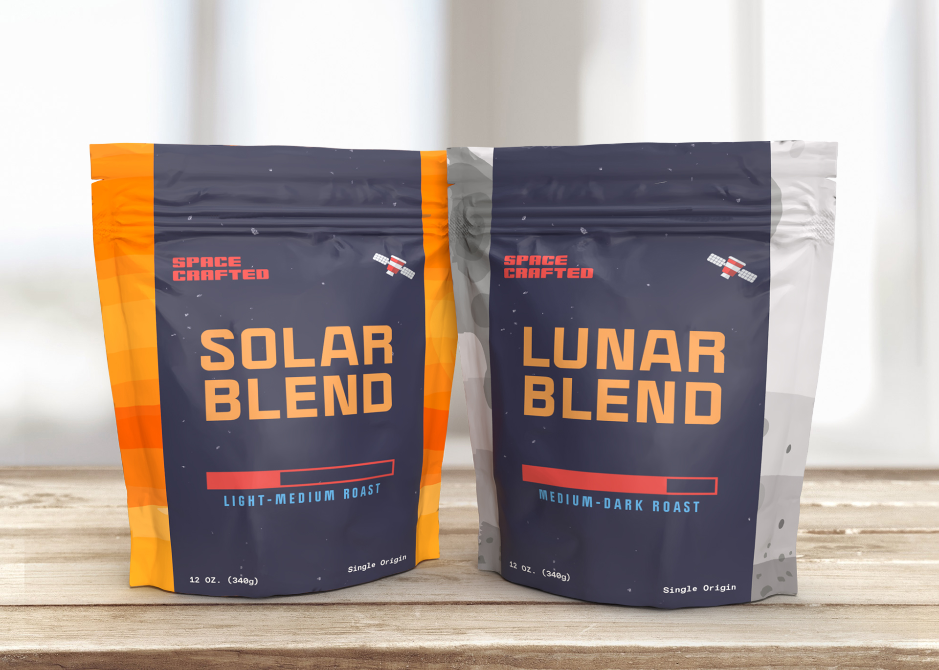
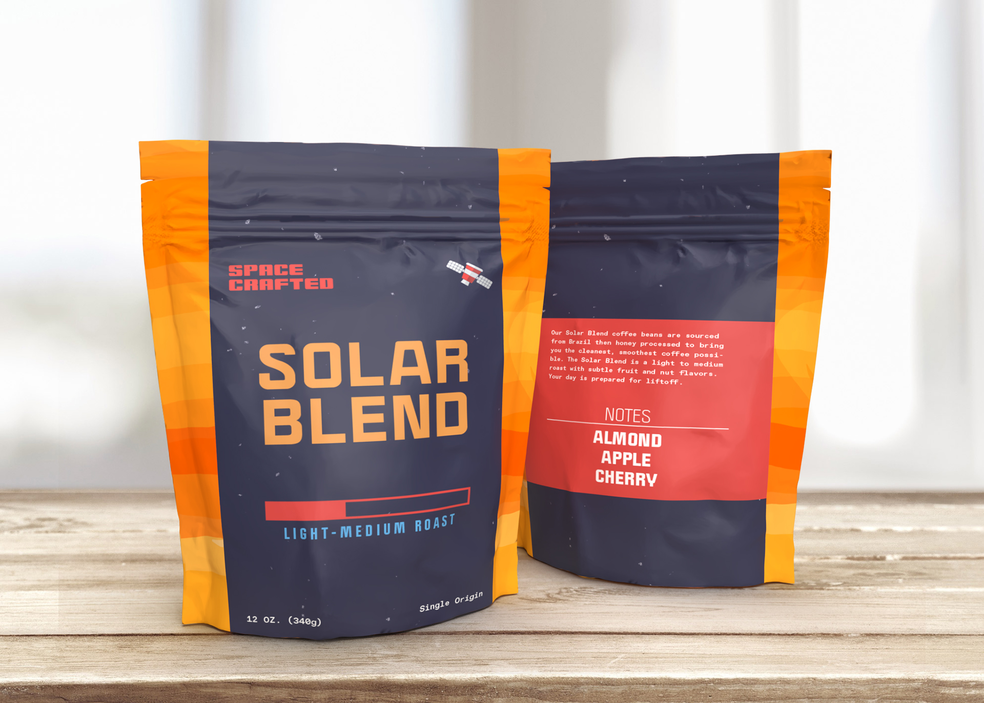
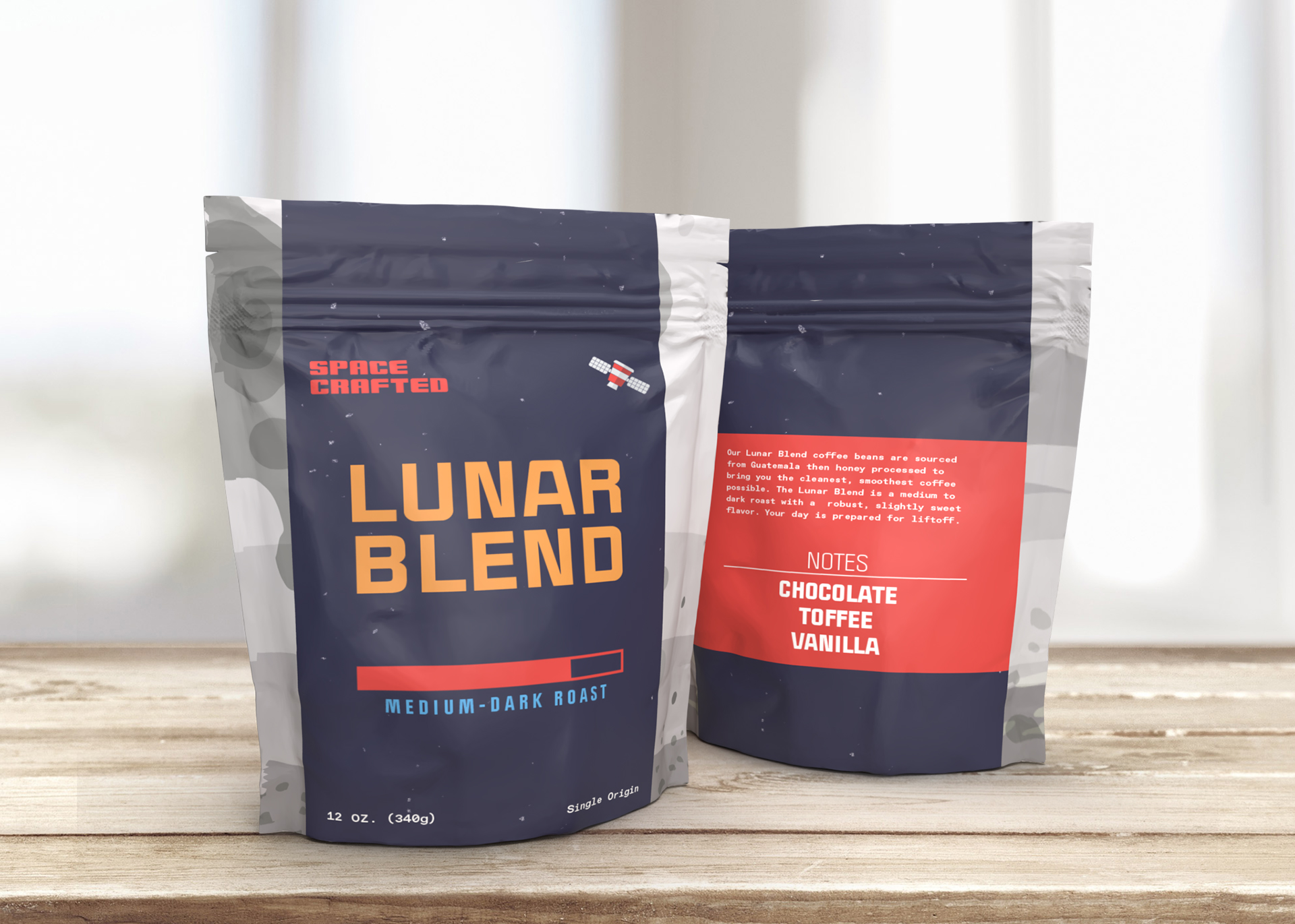
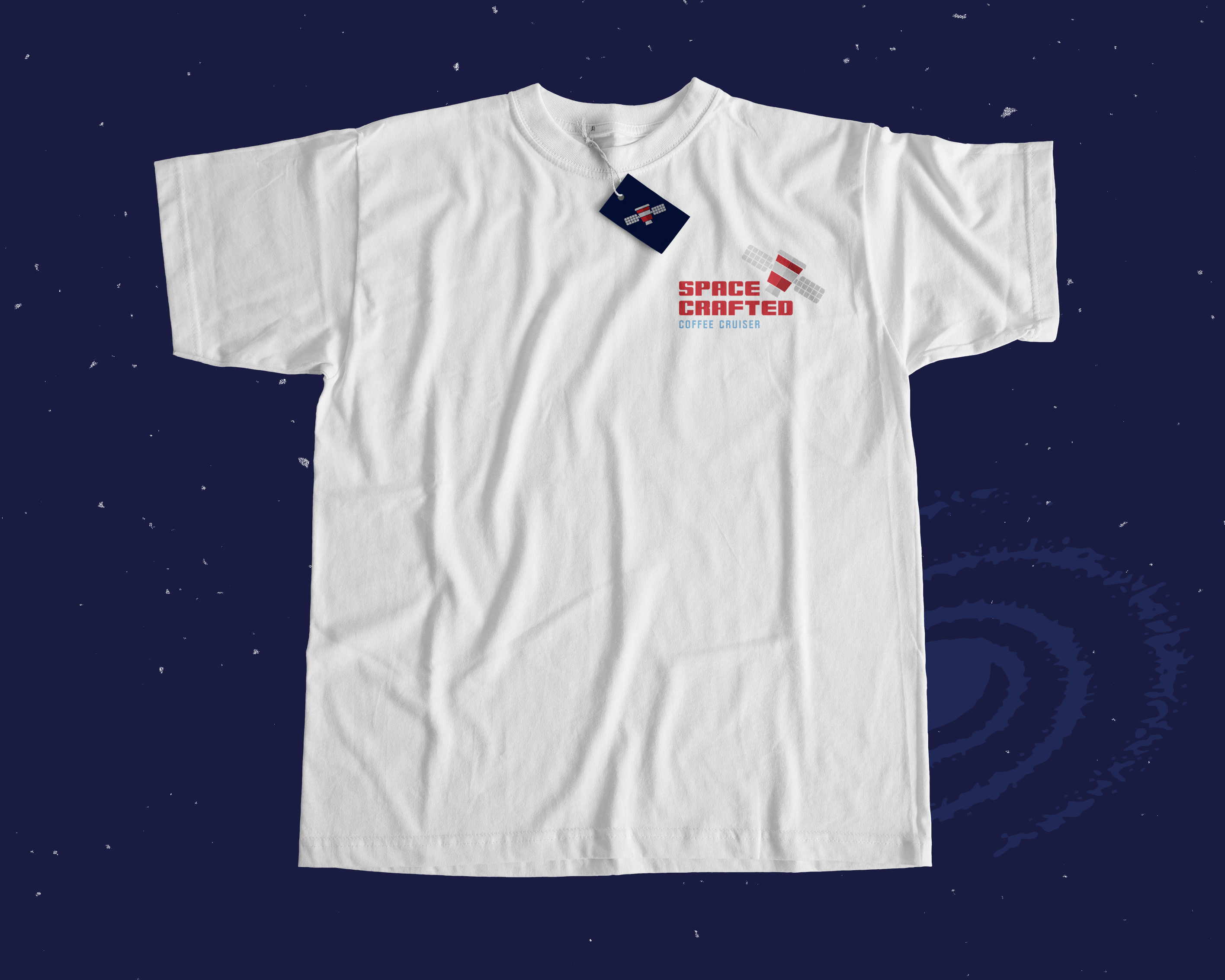
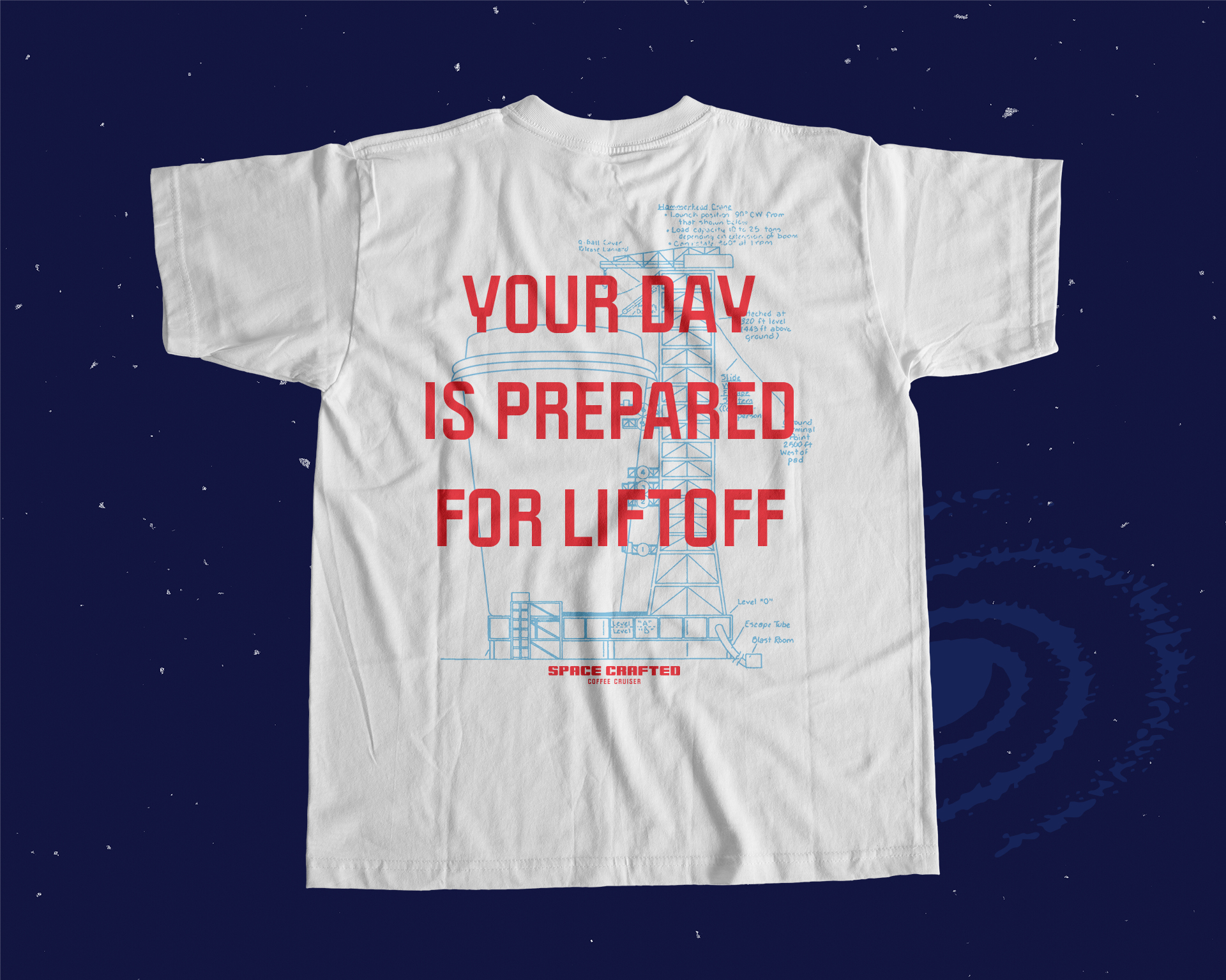

The Space Crafted brand borrows from a number of references for a familar but fresh package. Flat graphics and repurposed spaceship schematics build the world of the Space Crafted Coffee Cruiser. Inspired by NASA, the Jetsons, and sci-fi novels of the past, Space Crafted puts a modern spin on the traditional space theme. Using bright colors and modern typography, Space Crafted brings the past to the present for an engaging way to start your day.

A Space Crafted alternate logo.
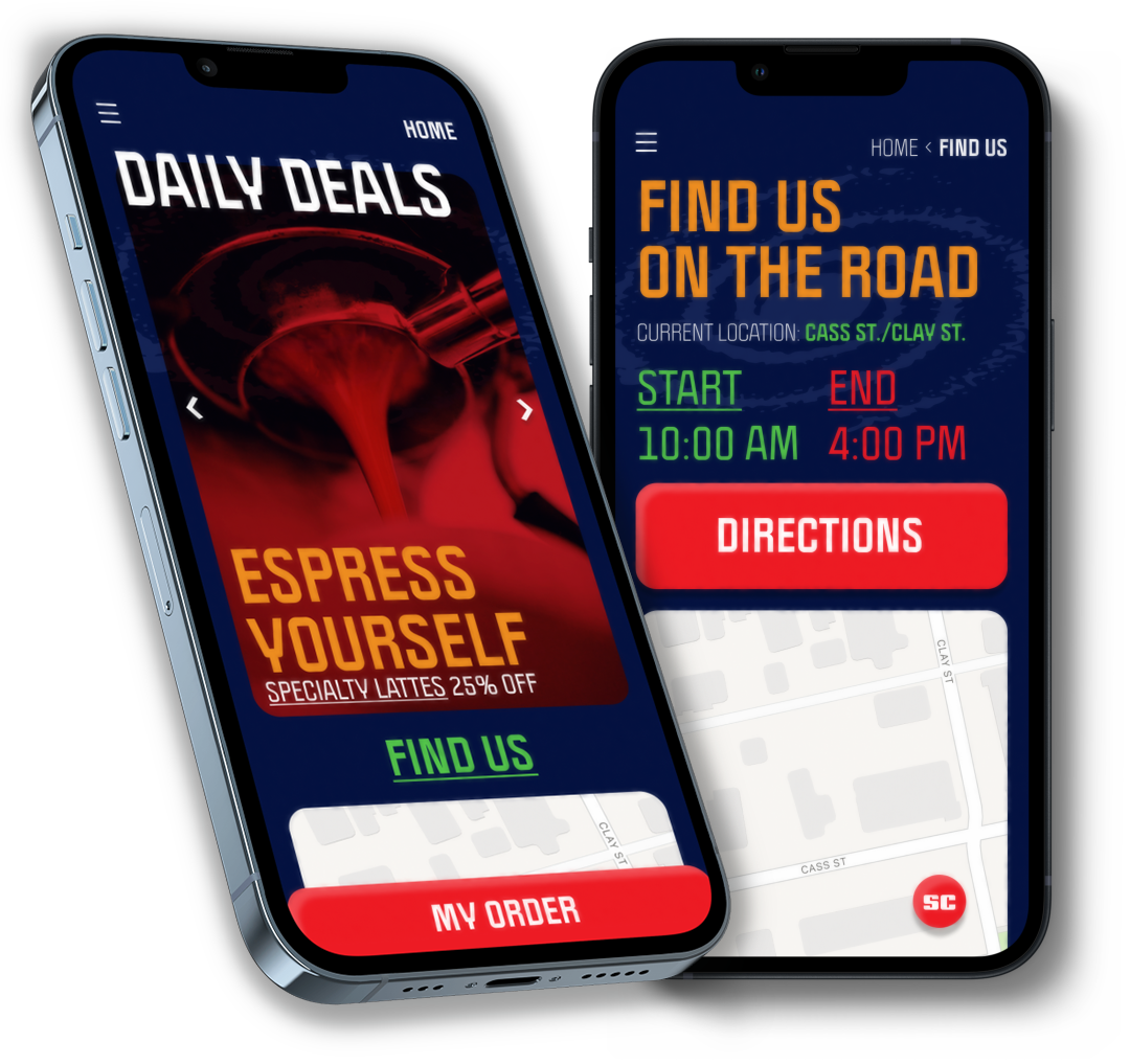 Home and Location pages for the Space Crafted mobile app.
 Coffee menu page and Cold Brew item page in the Space Crafted mobile app.
Trail Town Pale Ale
Can Label, Poster, Billboard
Art DirectionPackaging Design
Trademark Design
My brand concept for the Dayton Beer Company’s “Trail Town Pale Ale” embraces the joys of exploring nature. I envisioned the “Trail Town” as a mystical place beyond the pines that can only be reached by the most adventurous hikers. The packaging and campaign visuals utilize vibrant colors and psychedelic themes that blur the line between reality and imagination.
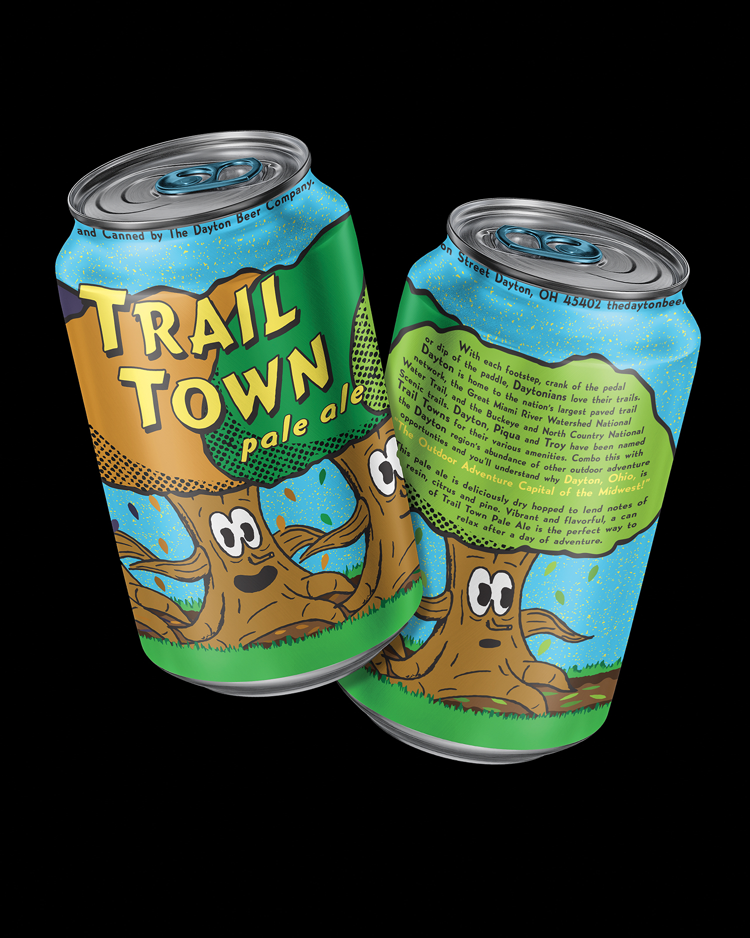
Trail Town Pale Ale can mockups.
This project was the first time I leaned on hand illustration in my design work. In order to set the right tone for the brand I needed the organic imperfection of hand work. I drew from 1970s cartoons in my exploration of characters. I began with a pencil sketch of my tree trunk character and scanned it to do some further refining in Photoshop before converting it to vector.
Choosing a bright color palette was important in creating a can that would grab shoppers’ attention at the grocery store. Bold blue, greens, and yellow reference nature in a way that sticks out on a shelf. The entire brand is meant to be playful, free, and casual. The theme of the wilderness takes a mysterious turn, using urban legends and alternate realities to interest the consumer. Using found security footage and psychedelic visuals, I was able to blur the line between fantasy and reality.

A Trail Town promotional poster using chromatic abberation to create a pychedelic effect.
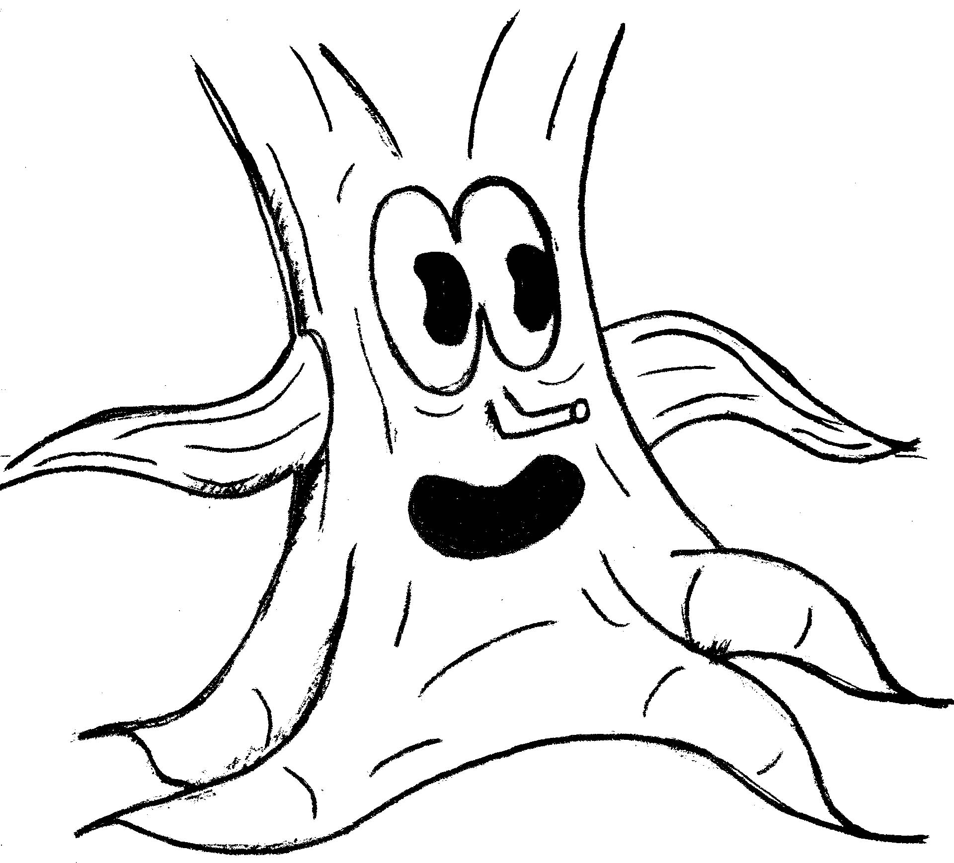
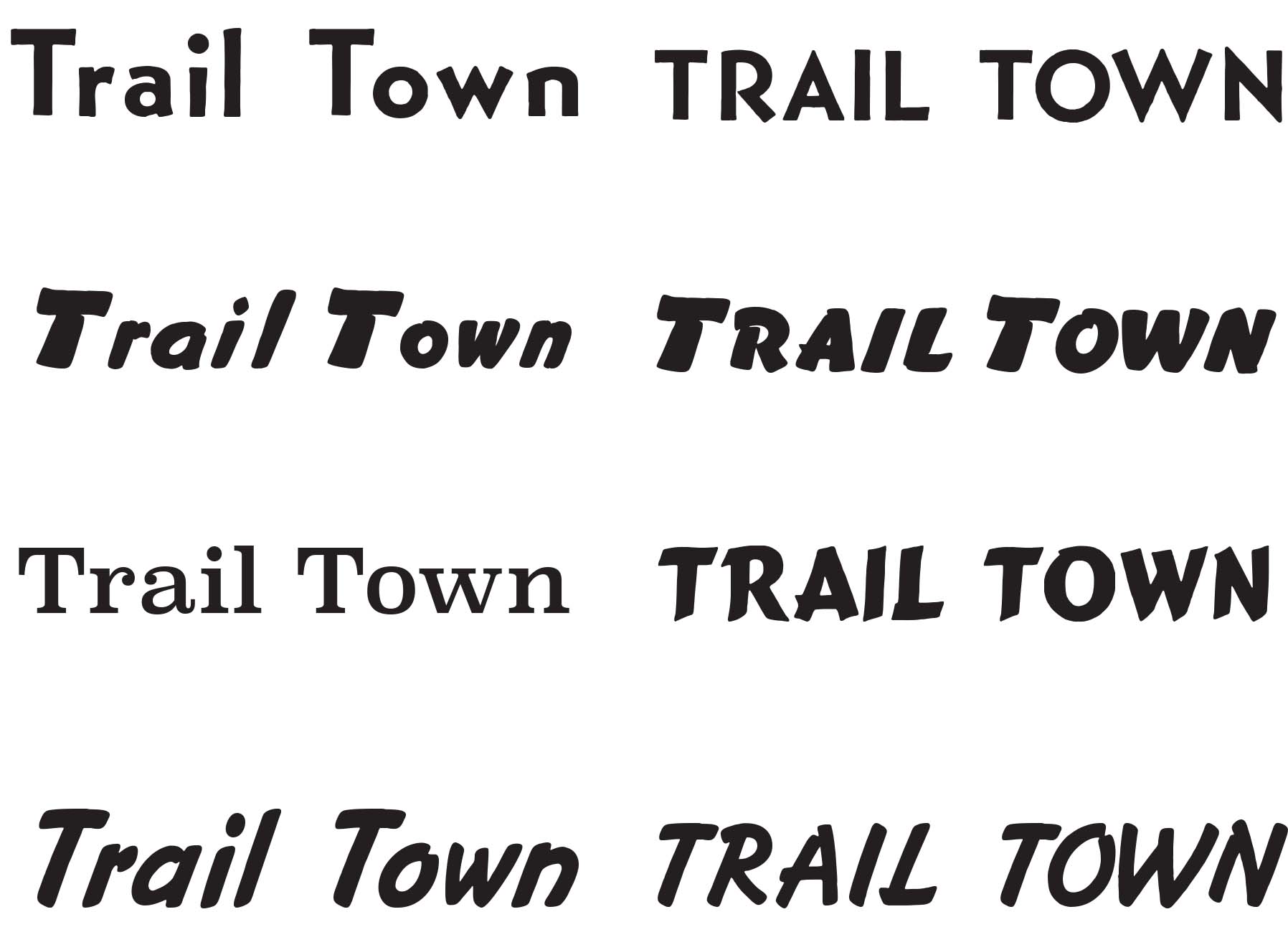
A preliminary pencil sketch and type explorations for the Trail Town brand.
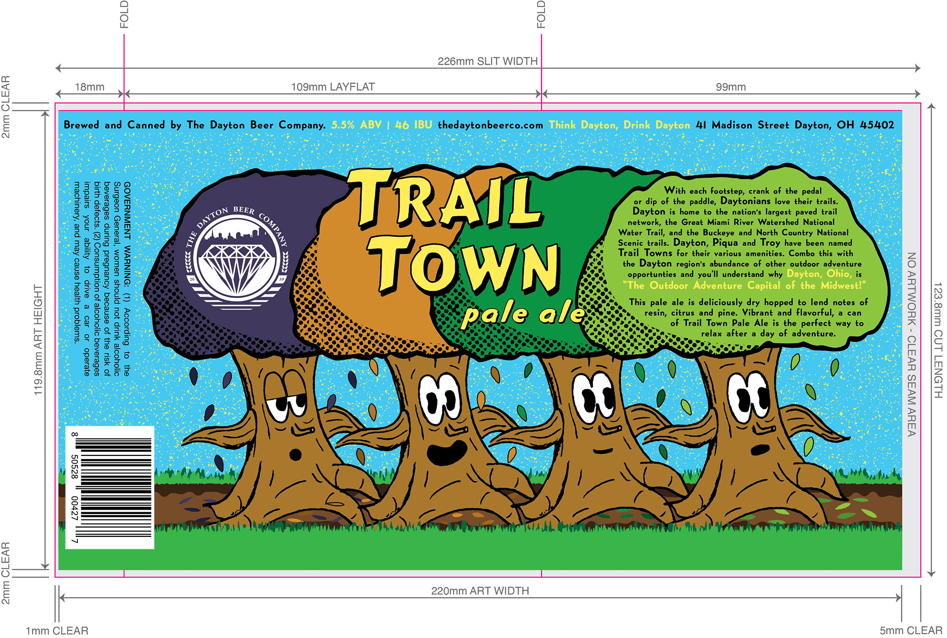
The flat Trail Town label shown in the context of the production template it was built for.
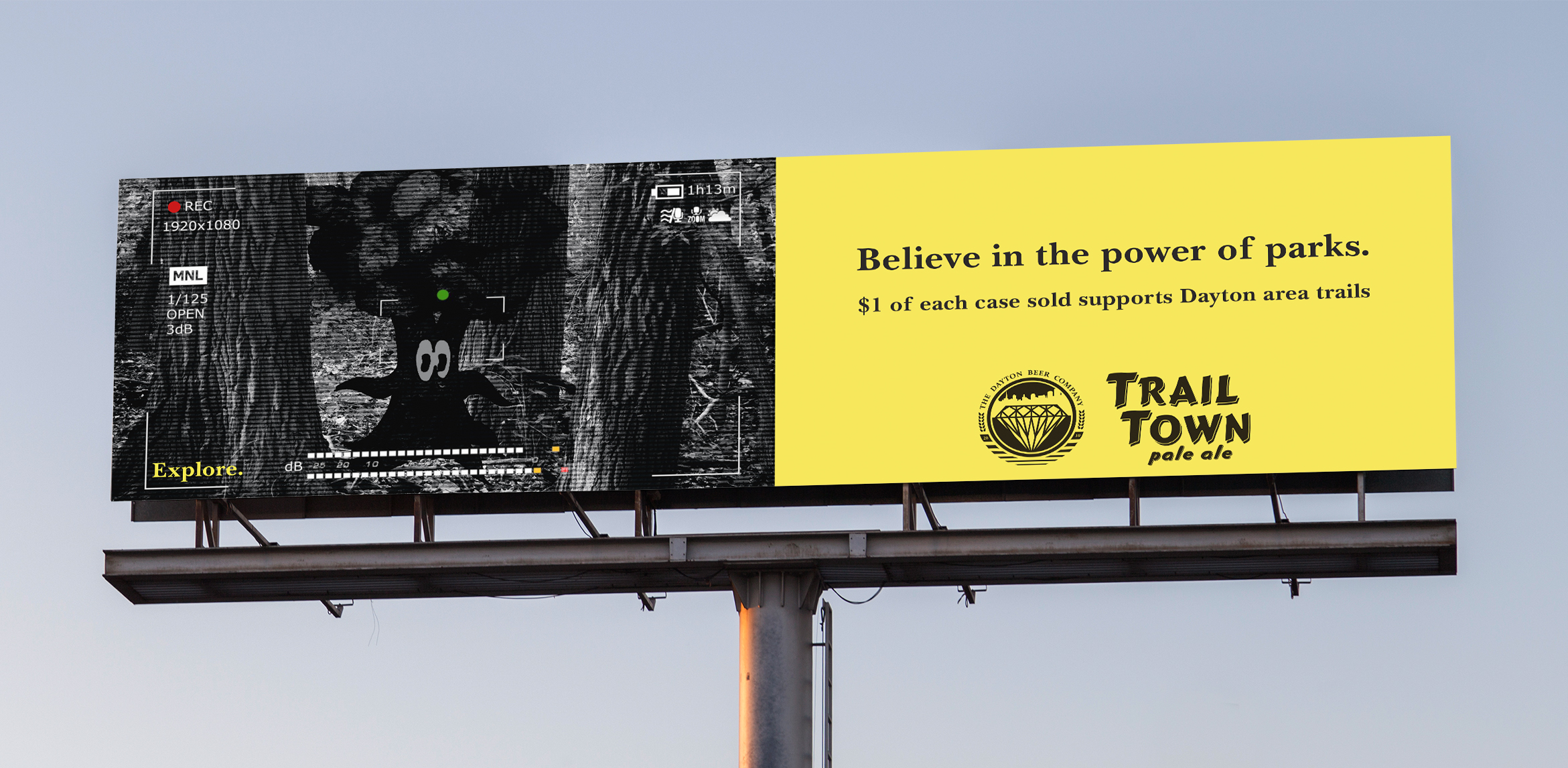
A Trail Town billboard ad featuring a “found footage” motif.
Loveland Youth
Baseball Organization
Logos, Uniform, Digital and Print Advertising
Apparel DesignTrademark Design

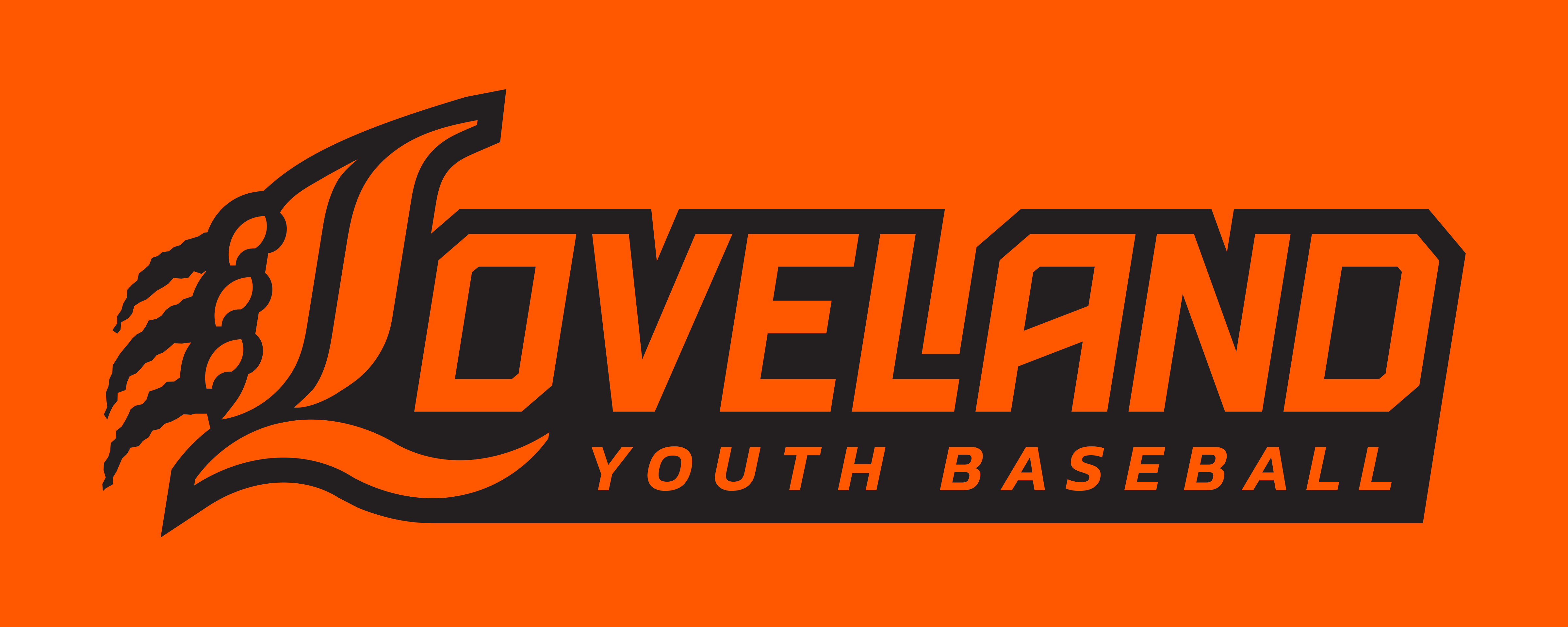
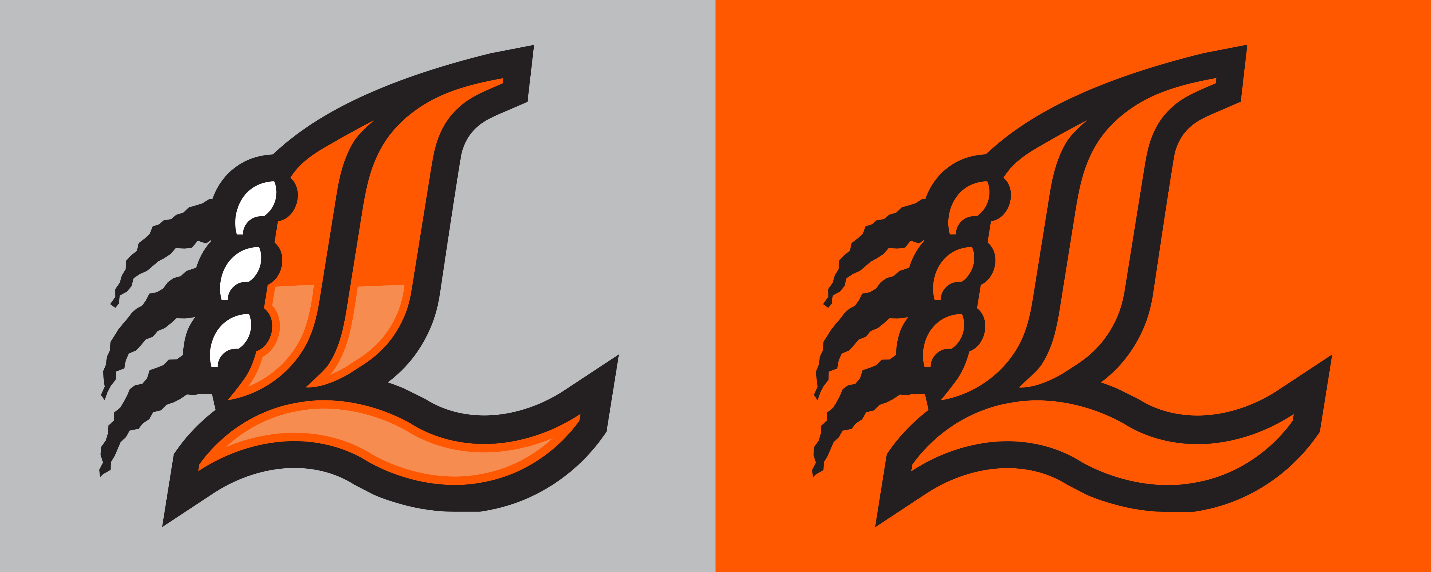
My brand concept for the Loveland Youth Baseball Association (LYBO) borrows from the town’s motifs for an inventive, modern solution. The scope of the project required primary and alternate logo lockups, a full kit uniform for multiple age groups, photographic treatments, PowerPoint graphics and a brand guide to pull it all together.
A suburb of Cincinnati, Loveland embraces black, orange, and a tiger mascot for its high school and city branding. While the LYBO does not use the tiger mascot explicitly, subtle nods to it were encouraged. The final solution combines a classic blackletter baseball logo with a sleek, modern approach. The “L” references tiger stripes and claws in a way that is referential to the classic blackletter baseball logo. Working backwards from the typeface Chomsky, I reduced the complicated blackletter form into a polished athletic logo then added outlines and highlights that would emphasize its forms.
![]()
Early letter style exploration that influenced the final mark.
A suburb of Cincinnati, Loveland embraces black, orange, and a tiger mascot for its high school and city branding. While the LYBO does not use the tiger mascot explicitly, subtle nods to it were encouraged. The final solution combines a classic blackletter baseball logo with a sleek, modern approach. The “L” references tiger stripes and claws in a way that is referential to the classic blackletter baseball logo. Working backwards from the typeface Chomsky, I reduced the complicated blackletter form into a polished athletic logo then added outlines and highlights that would emphasize its forms.

Early letter style exploration that influenced the final mark.

A social media post made according to LYBO brand imagery standards.
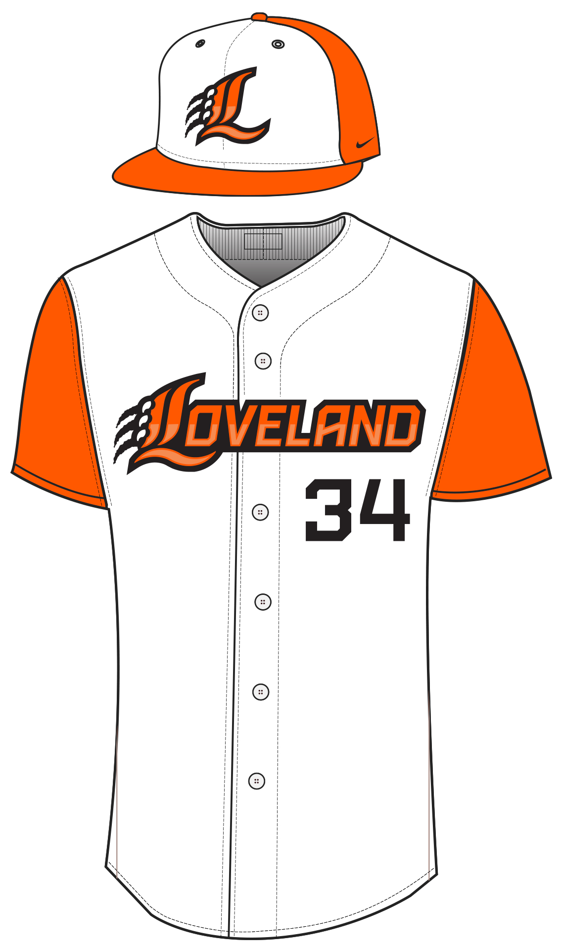
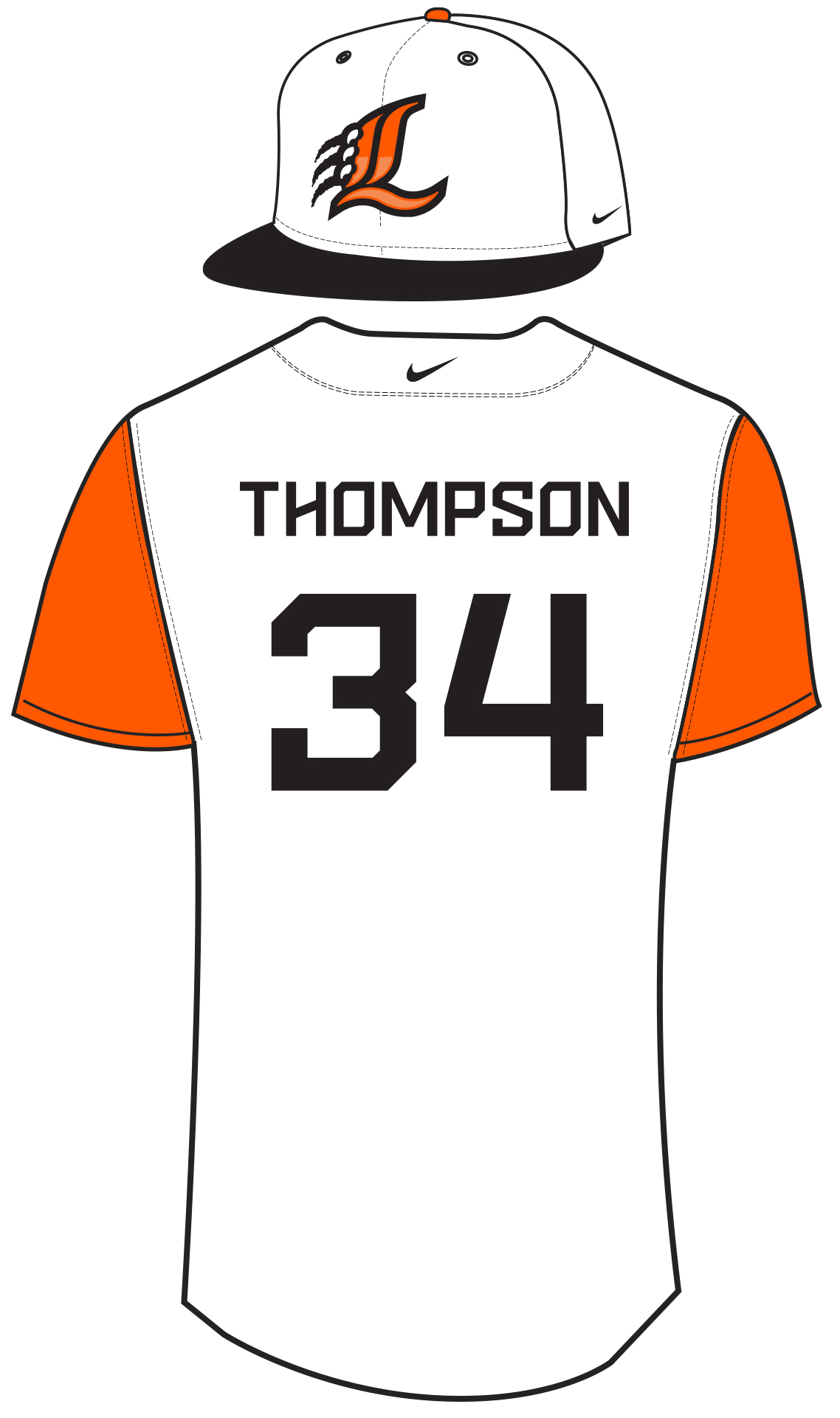
A front and back view of the LYBO uniform top and two hat options.
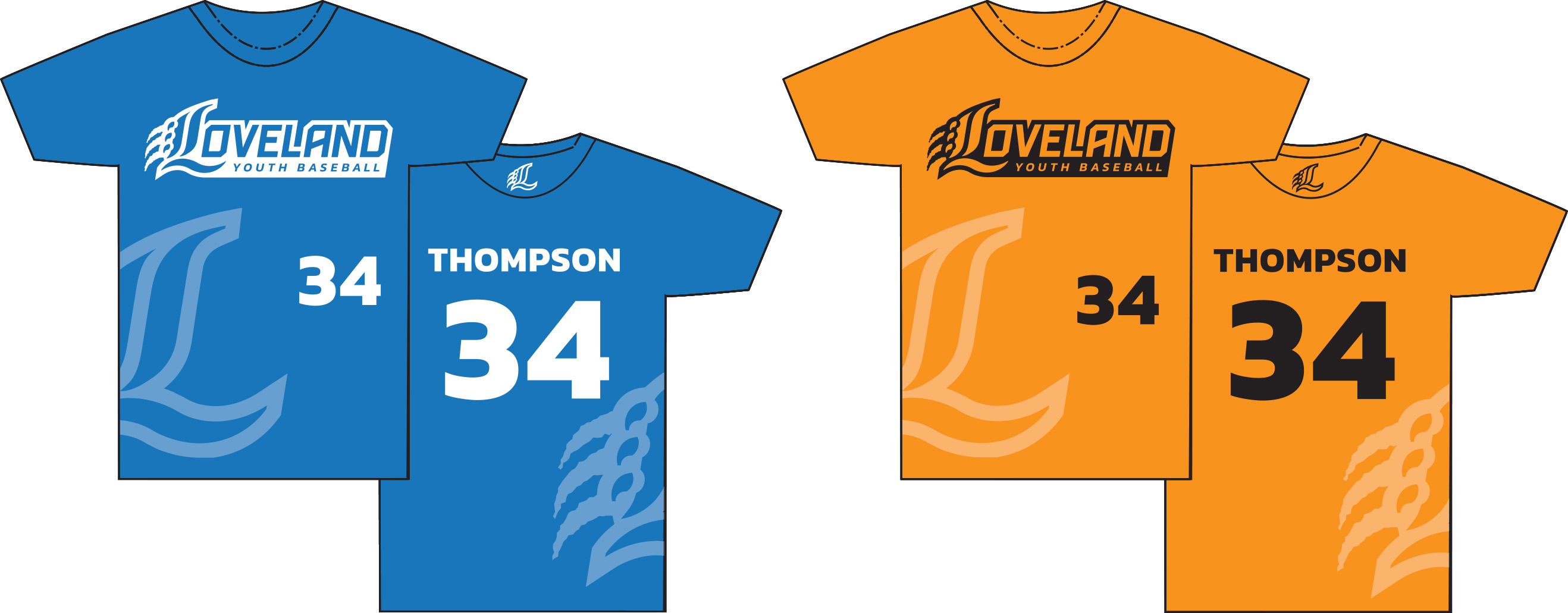
Uniform options for the younger intrasquad teams.
Burnt Pancakes
Apparel Company
Apparel DesignScreen Printing
Social Media
Burnt Pancakes is a self-initiated project that began in late 2019. I became inspired by bootleg concert t-shirts in the music communities that I follow and I decided to try making some myself. I made a graphic, bought a press, fabric dye, and ink and got to work in my garage. The bulk of these projects took place during the pandemic with no access to a proper studio, forcing me to get creative with my marketing. Two years later I’ve sold and shipped over 500 separate items on my Shopify store and earned a placement in a local coffee shop.
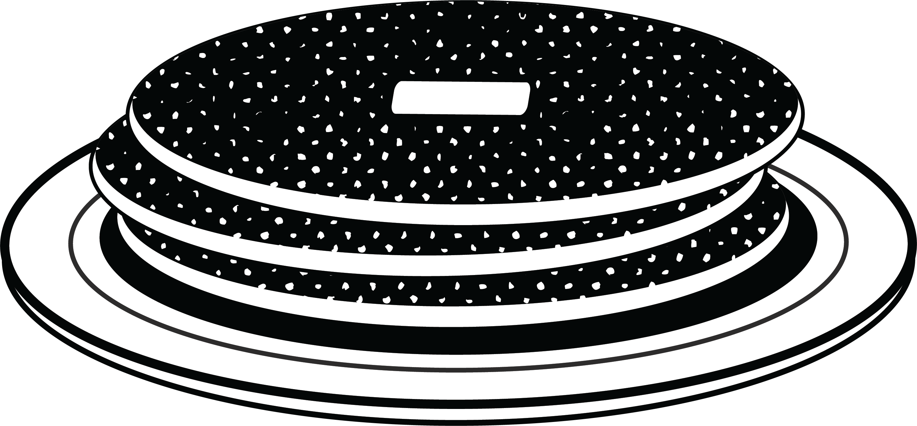
The Burnt Pancakes logo featuring the burnt halftone motif.
![]() A social media ad for Burnt Pancakes.
A social media ad for Burnt Pancakes.
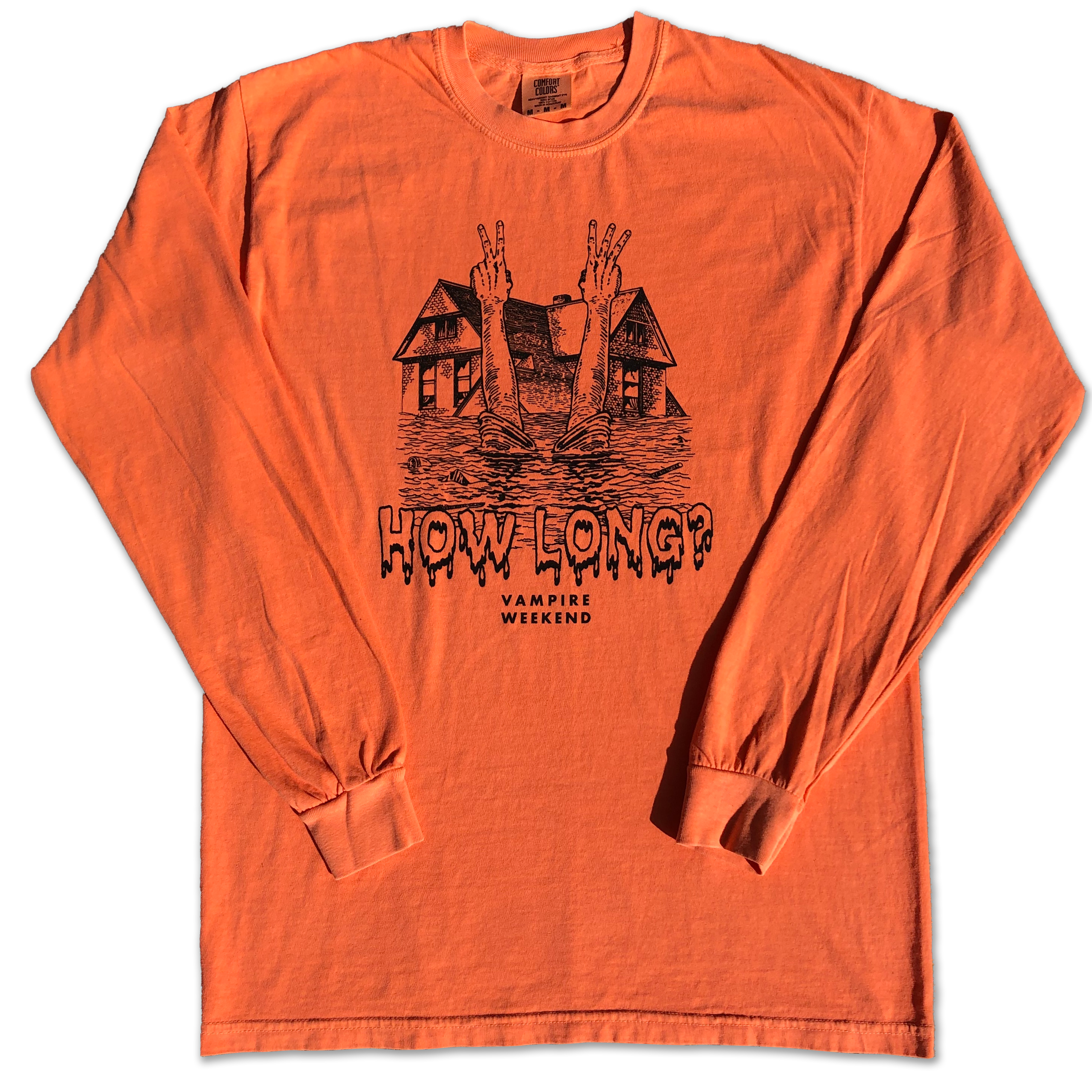

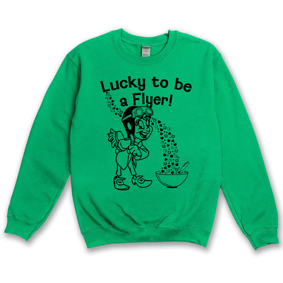
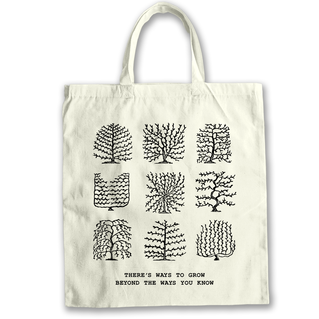
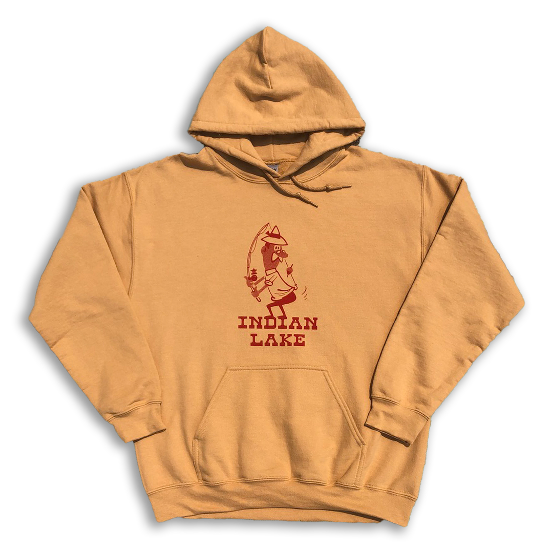

A sampling of Burnt Pancakes pieces tied, dyed, and printed by hand.
 A social media ad for Burnt Pancakes.