Hartzell Air Movement
Sales Trophies, Web Design
Hartzell Air Movement is a ventilation equipment manufacturer based in Piqua, OH that prides itself on its Midwestern heritage. Hartzell has been making fans, ducts, and propellors in America for six generations. The Hartzell brand uses a timeless style that communicates Hartzell’s history in the Rust Belt.
 A collection of three Hartzell Air Movement Sales Award trophies.
 A detailed shot of the fan model, name sticker, and modular wooden base.
Through my contracted freelance position at Real Art Design Group in Dayton, I contributed to physical and digital projects for Hartzell Air Movement. Hartzell wanted to create a sales award trophy to reward their top-selling distributors each year. The award needed to reflect the brand’s industrial style, showcase their product, and be personalizable to each recipient. Working with an excellent team of fabricators and project managers, we devised a trophy composed of a metal back representing a fan blade and a base made from red oak sourced from Hartzell’s sibling company, Hartzell Hardwoods. The base is modular so that new year blocks can be added for subsequent achievements. The trophy’s centerpiece is a model of one of Hartzell’s best-selling fans complete with a chip insert showcasing the recipient’s name.
![]() A detailed shot of the silk screened graphics on the back panel.
A detailed shot of the silk screened graphics on the back panel.
I oversaw production design for the trophies and coordinated a number of aspects of the project. From setting the final meaurements of the pieces to choosing wood stock for the base and designing the graphics on the back panel, I was involved from start to finish. Coordination required keeping separate vendors on schedule to die cut the metal panel, silk screen the graphics, and produce the vinyl name stickers on time as well as 3D printing the fan model and assembling the trophies in house.
 A detailed shot of the silk screened graphics on the back panel.
I oversaw production design for the trophies and coordinated a number of aspects of the project. From setting the final meaurements of the pieces to choosing wood stock for the base and designing the graphics on the back panel, I was involved from start to finish. Coordination required keeping separate vendors on schedule to die cut the metal panel, silk screen the graphics, and produce the vinyl name stickers on time as well as 3D printing the fan model and assembling the trophies in house.
A scroll through the Hartzell Difference page on the Hartzell Air Movement website.
My work for Hartzell also included web design for two pages on hartzellairmovement.com. The “Hartzell Difference” page outlines the qualities that set Hartzell apart from other manufacturers. The brand’s history, commitment to quality, and excellent customer service are all highlighted on the page. Designing the page required prototyping a responsive layout that could easily be handed off to the development team for creation and retouching photos given to us by the team at Hartzell. The page has discrete sections with varying text and image layouts that keep the viewer engaged.
In addition to the creating the Hartzell Difference page, I was tasked with streamlining the Hartzell History page. The page’s original layout consisted of a clunky card system oversaturated with dates and no heirarchy between important milestones and minor developments. As a company that prides itself so much on its heritage, I wanted to show the viewer Hartzell’s history of craftsmanship. I was given access to an archive of images and schematics and created a collage in Hartzell’s industrial style to use as a header image and worked with Hartzell personnel to choose specific dates to call out in their own section.
The Hartzell History page layout.![]()

Space Crafted
Logos, Truck, Menu, Shirt, Hat, Coffee Bags, Mobile App
Art DirectionApparel Design
Brand Design
Copy Writing
Trademark Design
Space Crafted is a conceptual brand centered around a mobile coffee bar. The food truck style coffee bar, nicknamed the “Coffee Cruiser,” is a complete brand exploration that features a primary logo, several alternate logo lockups, a truck design, a menu, coffee cups and mugs, coffee bags, and merchandise such as t-shirts and beanies. Customers can find the truck’s location, menu items, and merch on the Space Crafted mobile app.

The Space Crafted truck viewed from the street
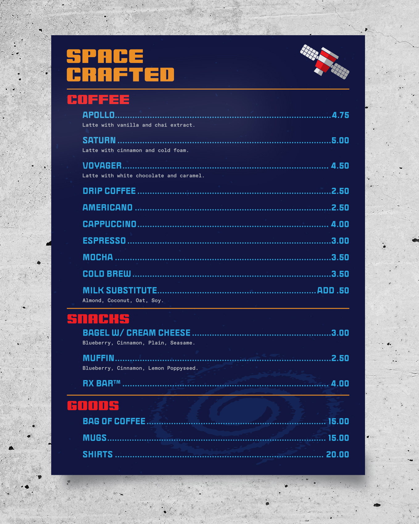
The Space Crafted paper menu.
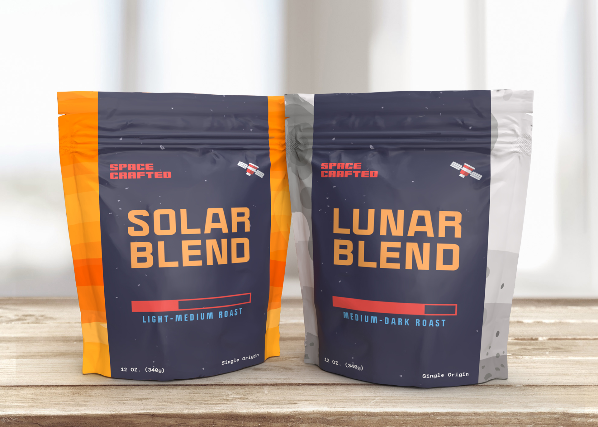
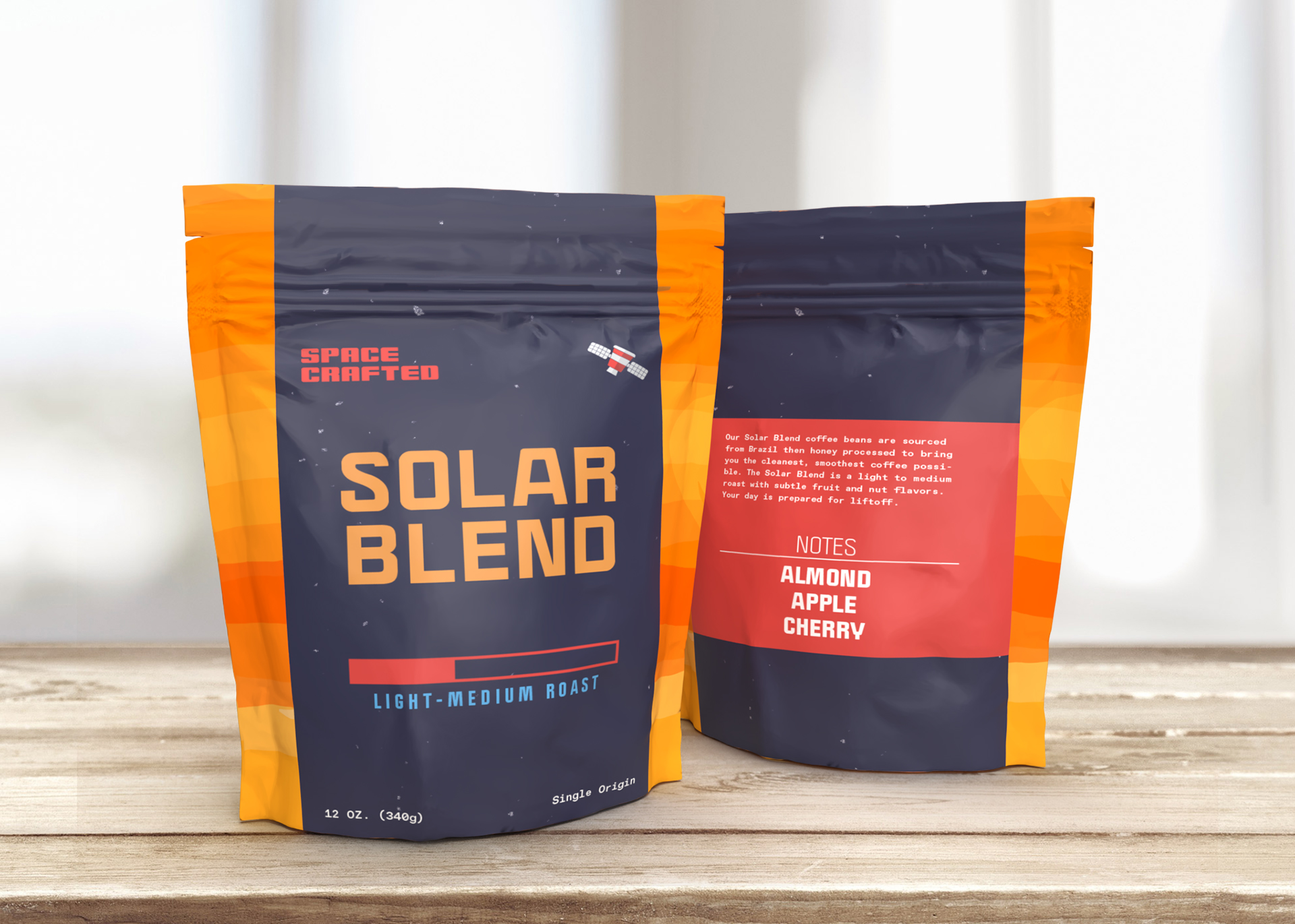
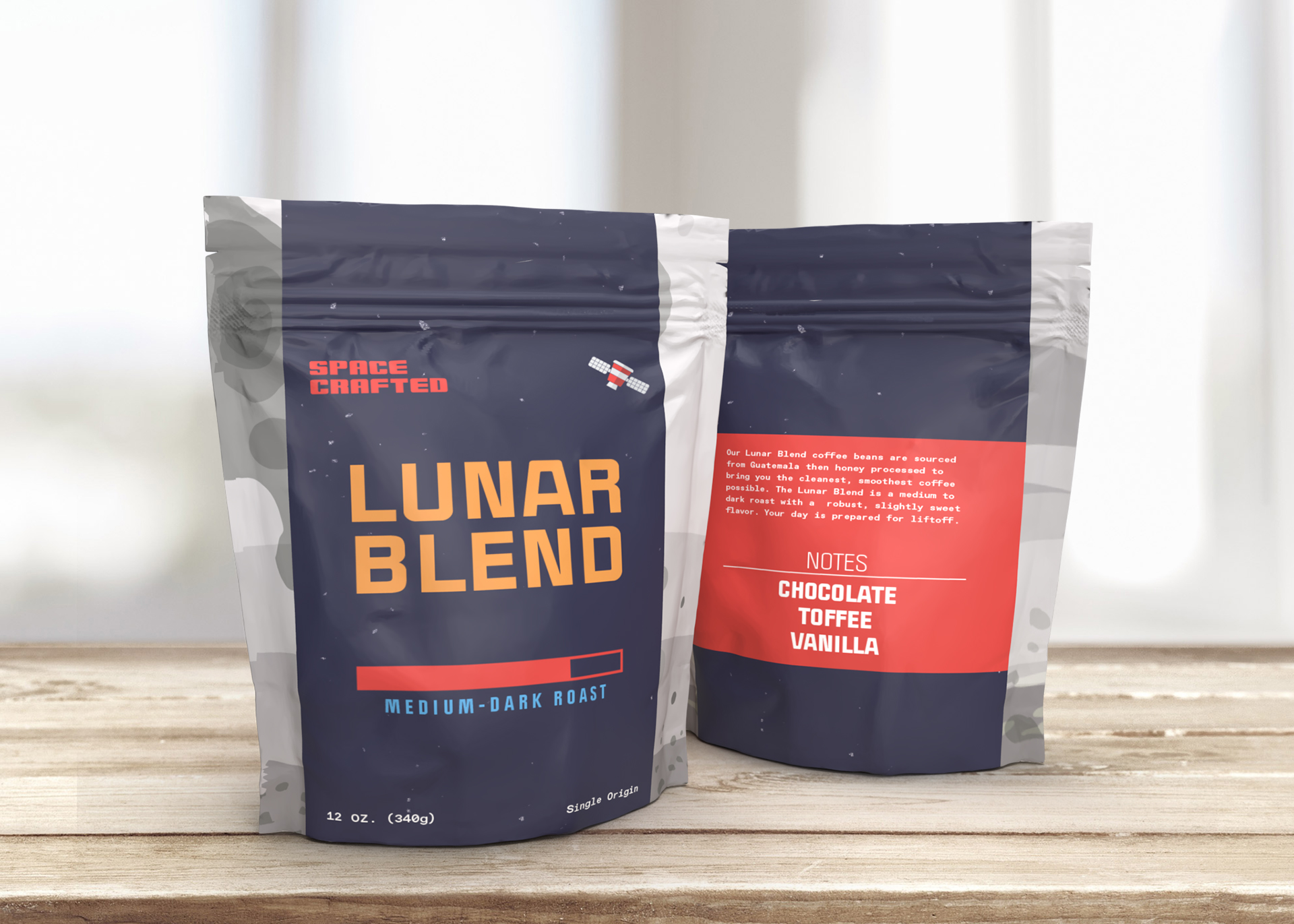
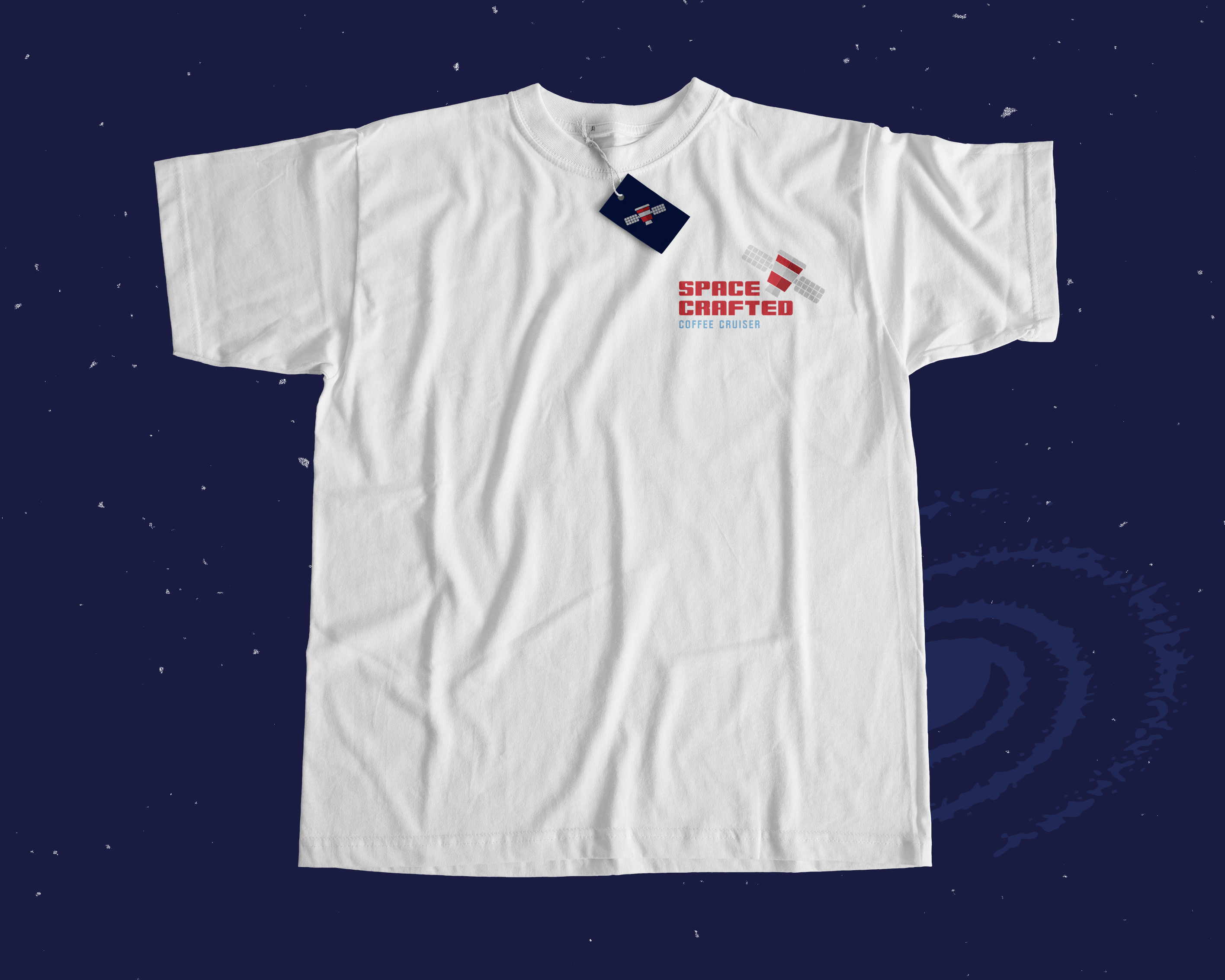
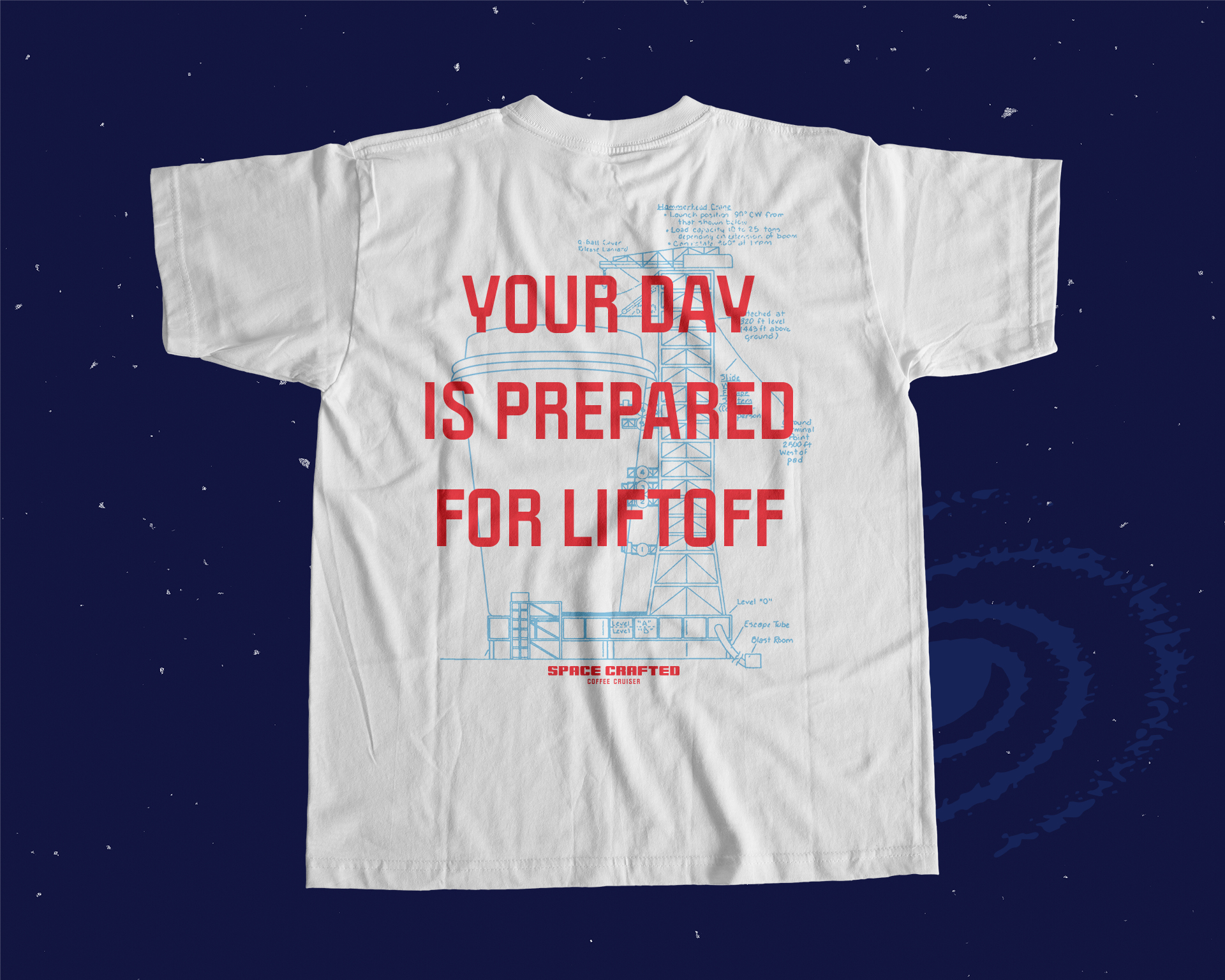

The Space Crafted brand borrows from a number of references for a familar but fresh package. Flat graphics and repurposed spaceship schematics build the world of the Space Crafted Coffee Cruiser. Inspired by NASA, the Jetsons, and sci-fi novels of the past, Space Crafted puts a modern spin on the traditional space theme. Using bright colors and modern typography, Space Crafted brings the past to the present for an engaging way to start your day.

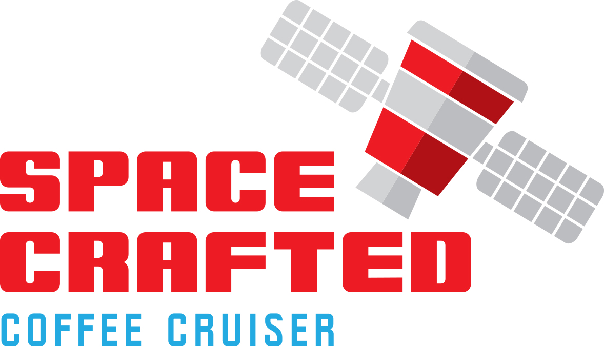
A Space Crafted alternate logo.
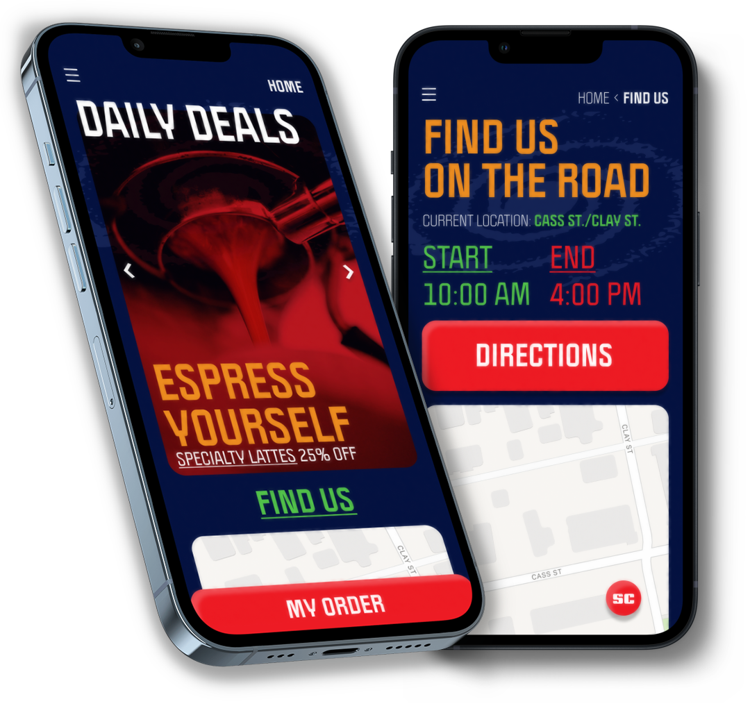 Home and Location pages for the Space Crafted mobile app.
 Coffee menu page and Cold Brew item page in the Space Crafted mobile app.
AI Educational Work
Attract Loop Screensaver, Animated Informational Videos, App Interface
This work was created in collaboration with Real Art Design Group for a confidential global artificial intelligence developer headquartered in Washington D.C. to educate visitors on the development and uses of AI technology.
Target and arrows asset used in the “How are Algorithms Evaluated?” video.
A sequence from the "How Are Algorithms Deployed?" video
Abstracted visualization of data points converging to a line of best fit.
Visual representation of a forward pass through a neural network.
As a contracted freelance designer at Real Art Design Group in Dayton, OH, I played a crucial role in creating motion design assets for a large AI developer. Deliverables for the project included a large scale screensaver animation, informational videos about the process of AI development, and title/lower third designs for interviews with leading computer scientists. All elements of the project exist as part of the interactive experience at the company’s headquarters in Washington D.C.
My work was overseen by Real Art’s Digital Team Art Directors. This project required a number of revisions from our team to script and storyboard content to ensure a refined final product. Script editing and clear communication with the client had a great impact on the resulting videos. My understanding of export settings and transcoding formats were essential to removing gradient banding, maintaining color depth, and utilizing transparent color space all while keeping files sizes manageable.
Full length “How are Algorithms Deployed?” video.
I was tasked with creating an app interface for the Cancer Pain Detection App that the developer created in collaboration with the National Institute of Health (NIH). The app asks users to respond to prompts about their comfort level using survey answers and video recordings. AI technology then tracks the responses and draws conclusions from the patient’s vocal tone, facial expressions, and survey answers.
The design of the app required a clear and understandable layout so as to not distract users during their responses. From the splash screen through the survey and video pages, the interface is easily navigable. Using simple tap commands and buttons, the interface allows users to complete their answers at the touch of a finger. Visitors at the company’s headquarters can try a demo version of the app to experience the technology in action.
 NIH Cancer Pain Detection App splash screen.
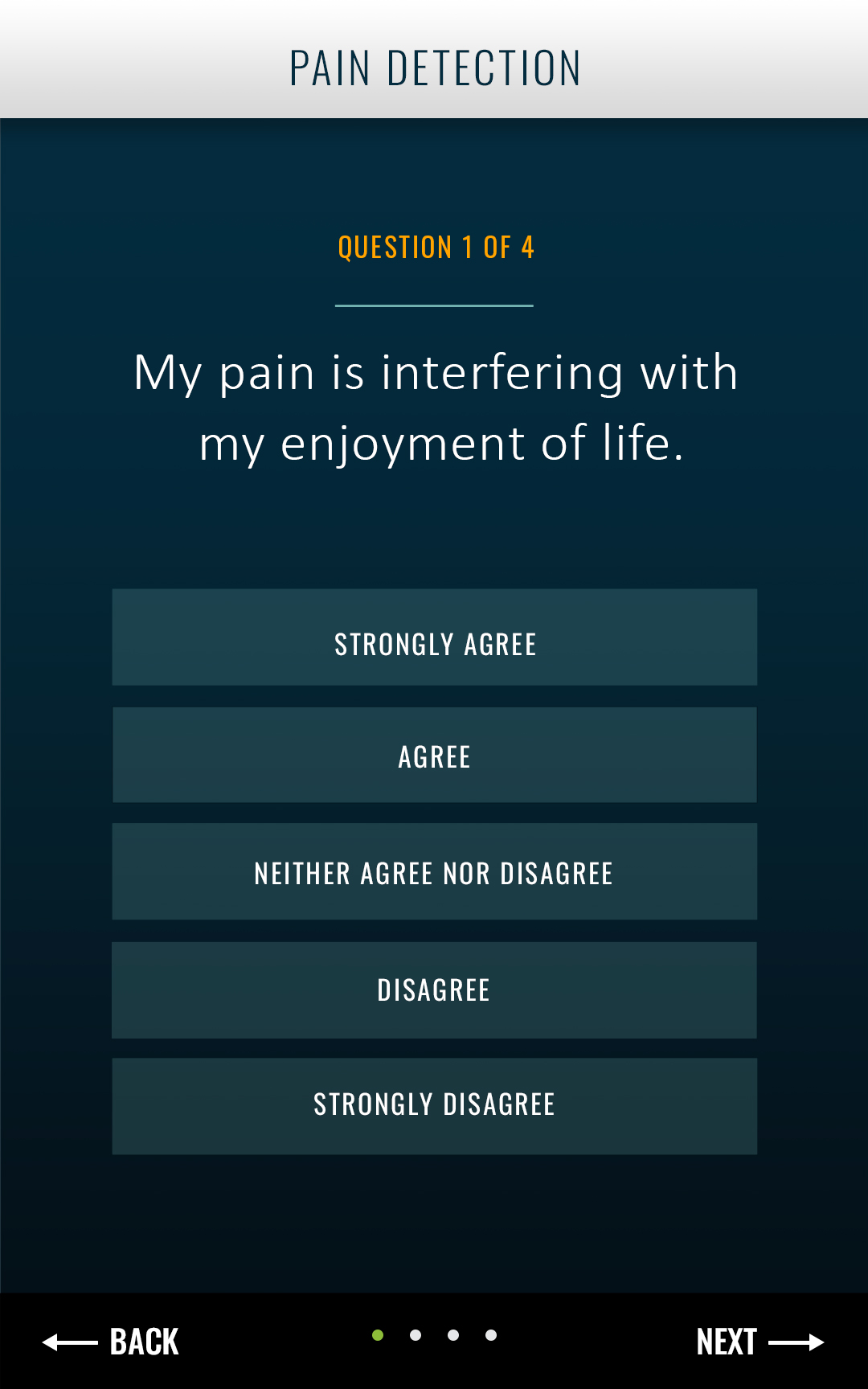 NIH Cancer Pain Detection App survey page.
 NIH Cancer Pain Detection App video response page.