Orpheus 119 01
Poster, Magazine
Publication DesignArt Direction
Photography
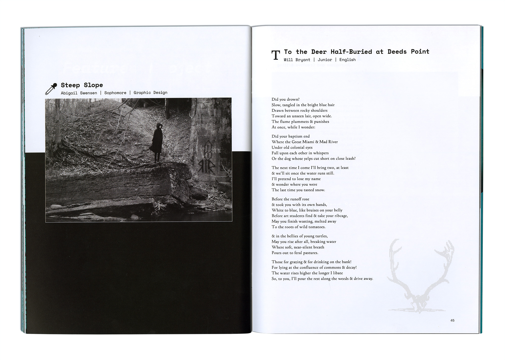
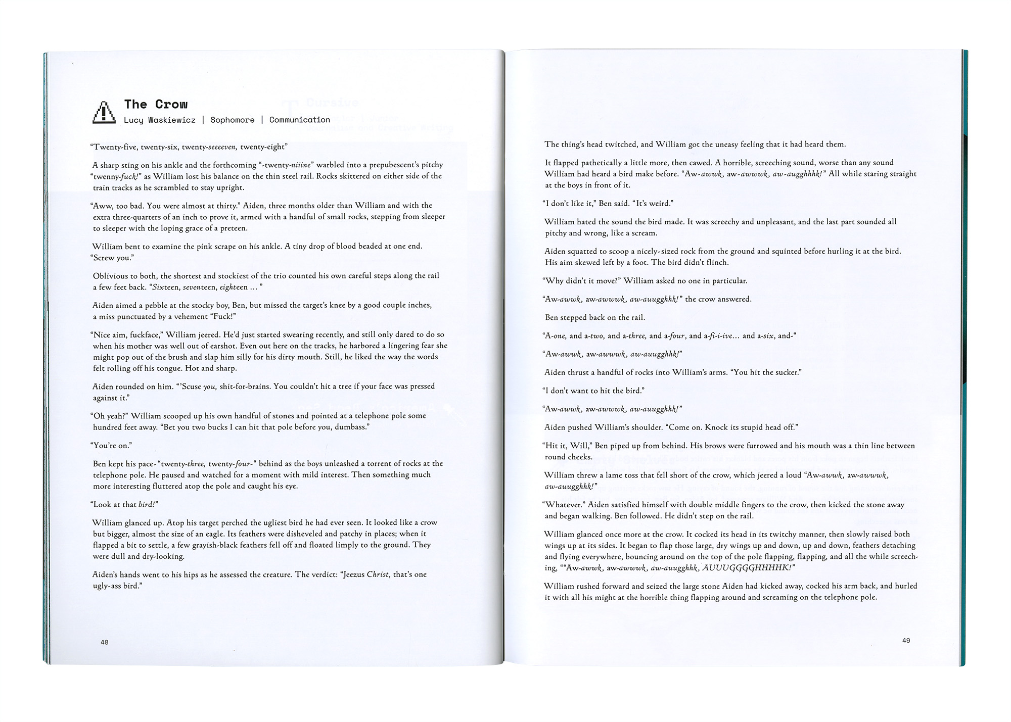
Orpheus Art and Literary Magazine is a student-run publication produced by University of Dayton design and English students. The magazine features fine art, graphic design, poetry, and short stories; selection of the work is overseen by a panel of professors.
Front cover with a gloss varnish over my image.
![]()

Back cover with a varnish treatment over the type.
![]()
My work on this piece included art direction, creating a set of posters, type setting, studio photography for the cover and theme pages, and working closely with print representatives on aspects of the physical magazine. The front and back covers feature a glossy spot varnish in contrast to the matte backgrounds.
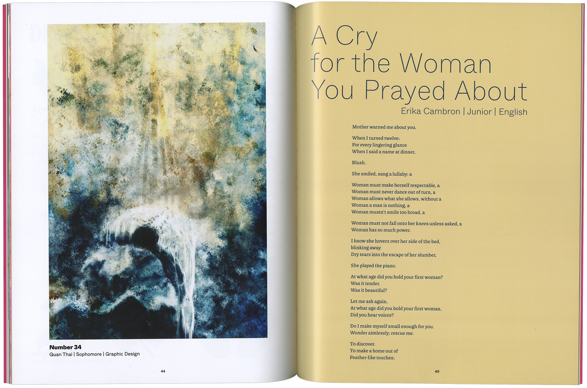
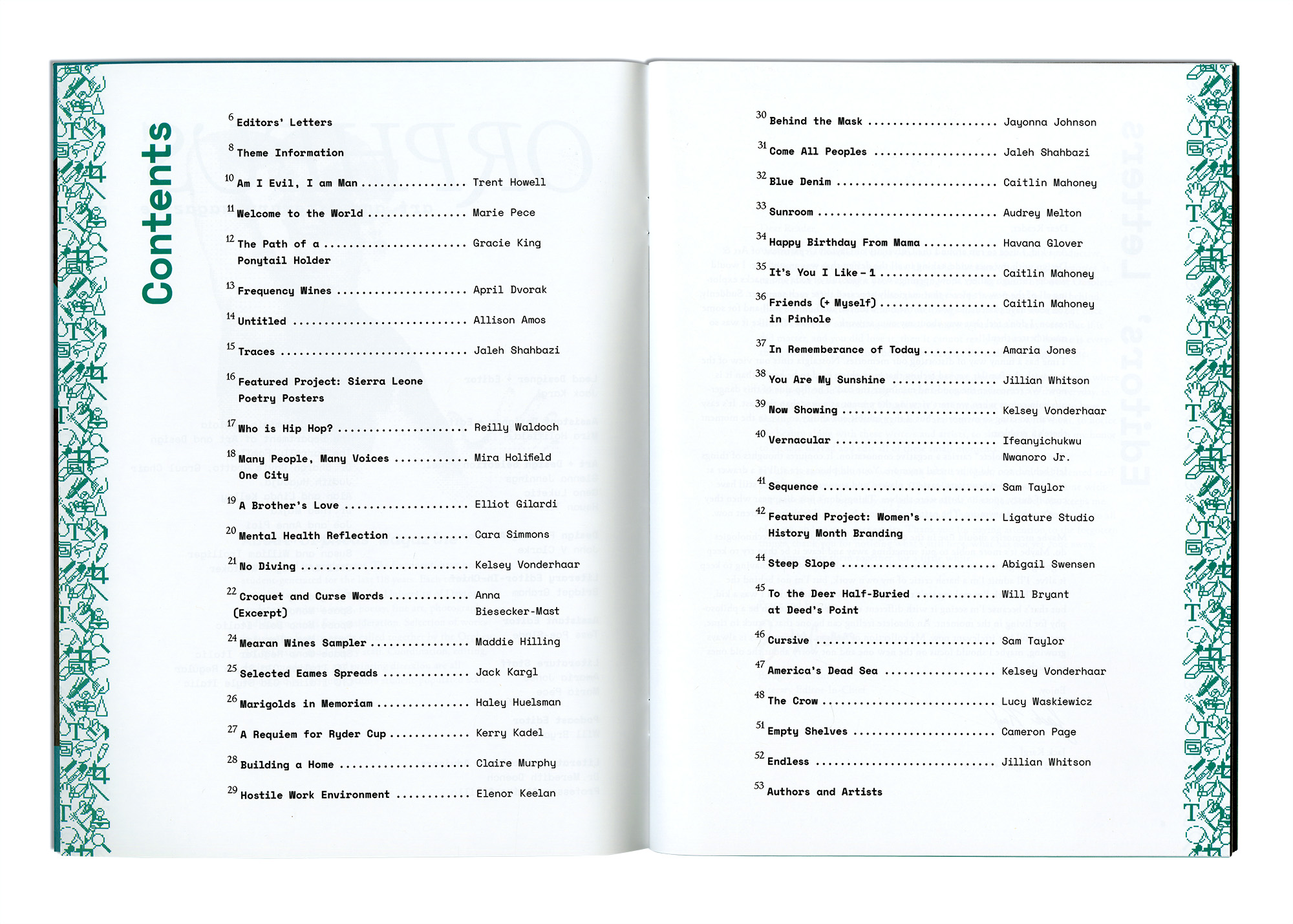
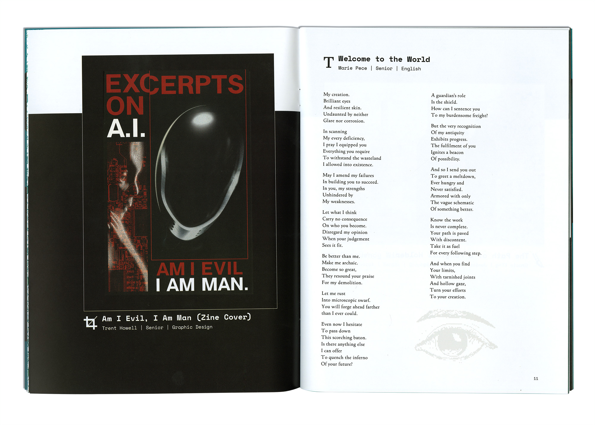
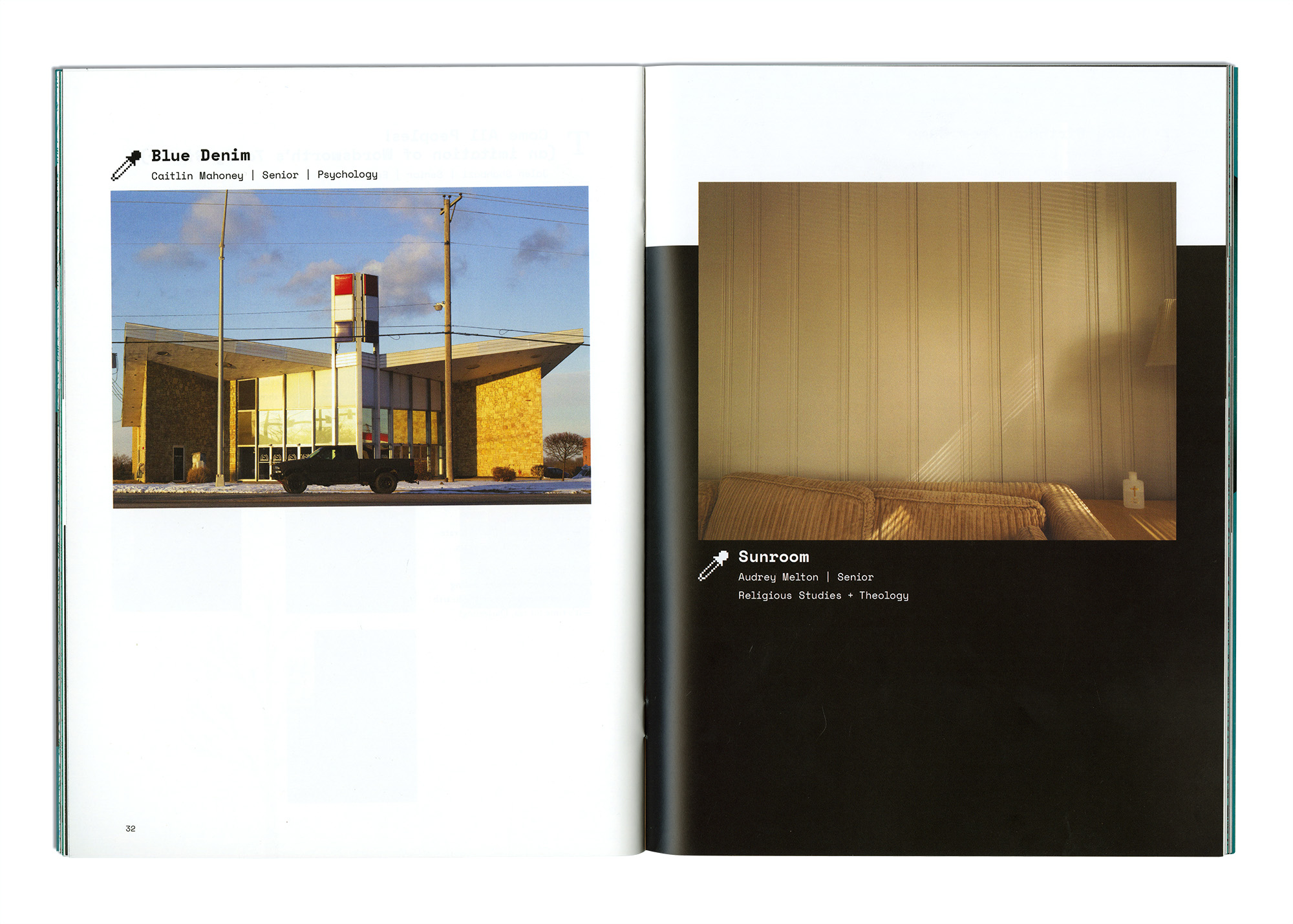
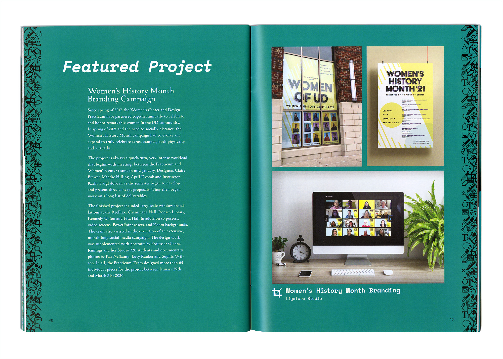
This issue of Orpheus is guided by the theme word “mouthfeel.” Contributors to the magazine tell their stories using imagery largely centering around food. Sensory comes to the forefront in this issue as color and texture lead the way. Many of the pages feature full frame photos and large panels of color to establish the mood of the spread. Using Dinamo’s ABC Whyte Variable typeface, I gave each literature piece a unique title treatment.
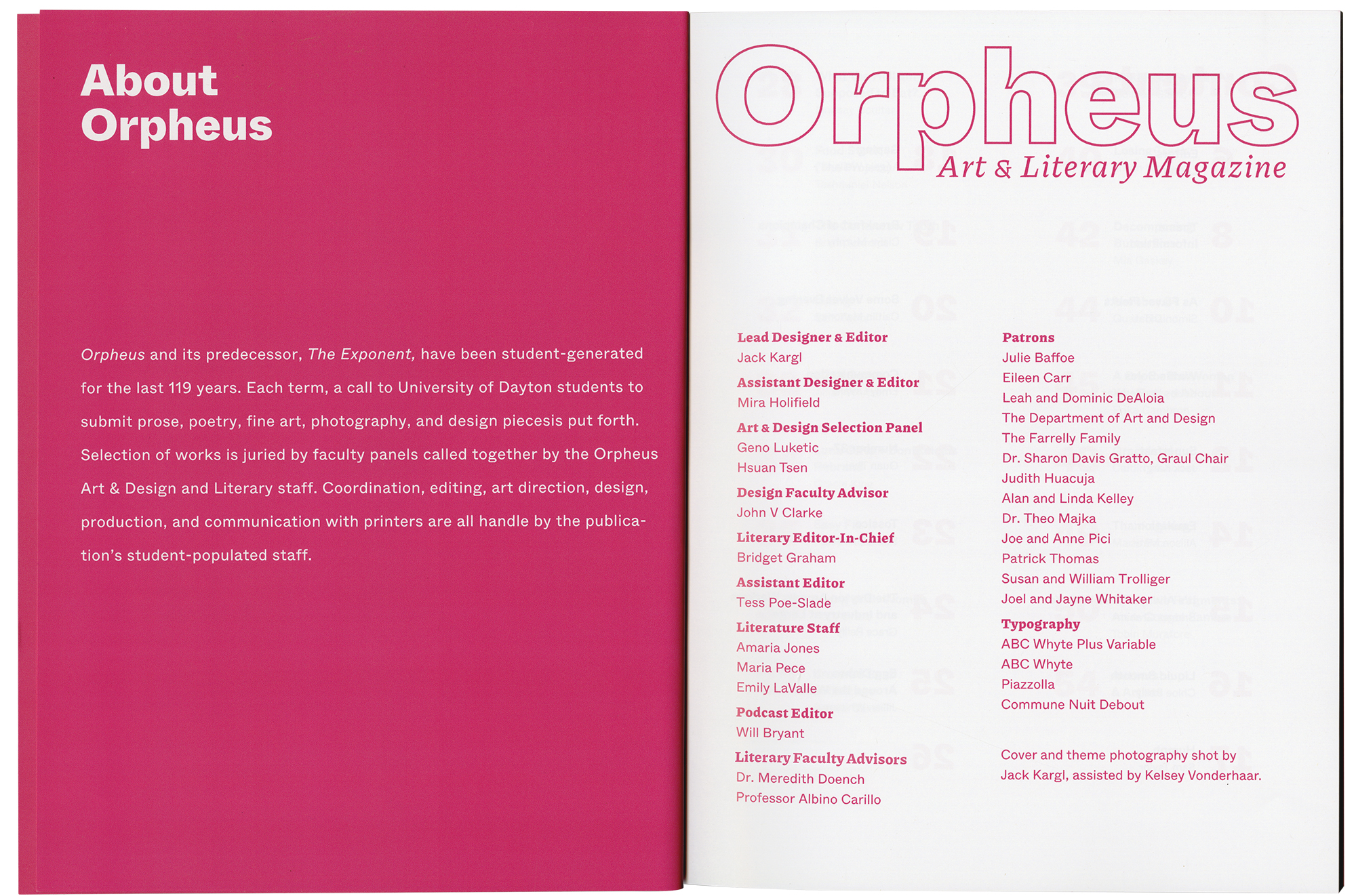
Click through the gallery below to see the About Orpheus and Contents spreads, Editor’s Letters, a theme description, and selected content.



Orpheus 118 02
Poster, Magazine
Art DirectionPublication Design
Orpheus Art and Literary Magazine is a student-run publication produced by University of Dayton design and English students. The magazine features fine art, graphic design, poetry, and short stories; selection of the work is overseen by a panel of professors.

The front cover of Orpheus Magazine Volume 118 Issue 02.

Orpheus submission posters for the original and extended submission dates.
The volume 118, issue 02 campaign began with posters to organize submissions and culminated in a 56 page publication. Production involved choosing Pantone colors, working within a page grid, creating graphics, and communicating with a print rep.
As the Lead Designer and Editor, I wanted to change course from the magazine’s traditionally minimal approach. Following with our “Obsolete” theme, the art direction borrows from a handful of outdated tech motifs. There are nods to bitmap imagery, early computer manuals, Photoshop 1.0, Windows 95, and Y2K screen saver patterns. Every medium featured in the magazine was designated with a separate icon. Each of the 400 magazines includes an individually numbered front cover.
Click through the gallery below to see some front matter, my editor’s letter, a theme description, and selected content spreads.

The Orpheus 118 02 information spread and front cover.



Desert Dispatch Issue #3
Magazine
Art DirectionPublication Design
Desert Dispatch is a publication put forth by the University of Dayton’s Art and Social Practice course in support of their “Dinner in the Desert Kitchen” (DDK) fundraising event. The magazine addresses food insecurity in the Dayton area using articles and photography submitted by students and overseen by professors. Issue #3, “Forage Ahead,” discusses systemic racism, the new Gem City Market, and features interviews with local non-profits, artists, and art galleries.
A stack of Desert Dispatch issues.
![]()
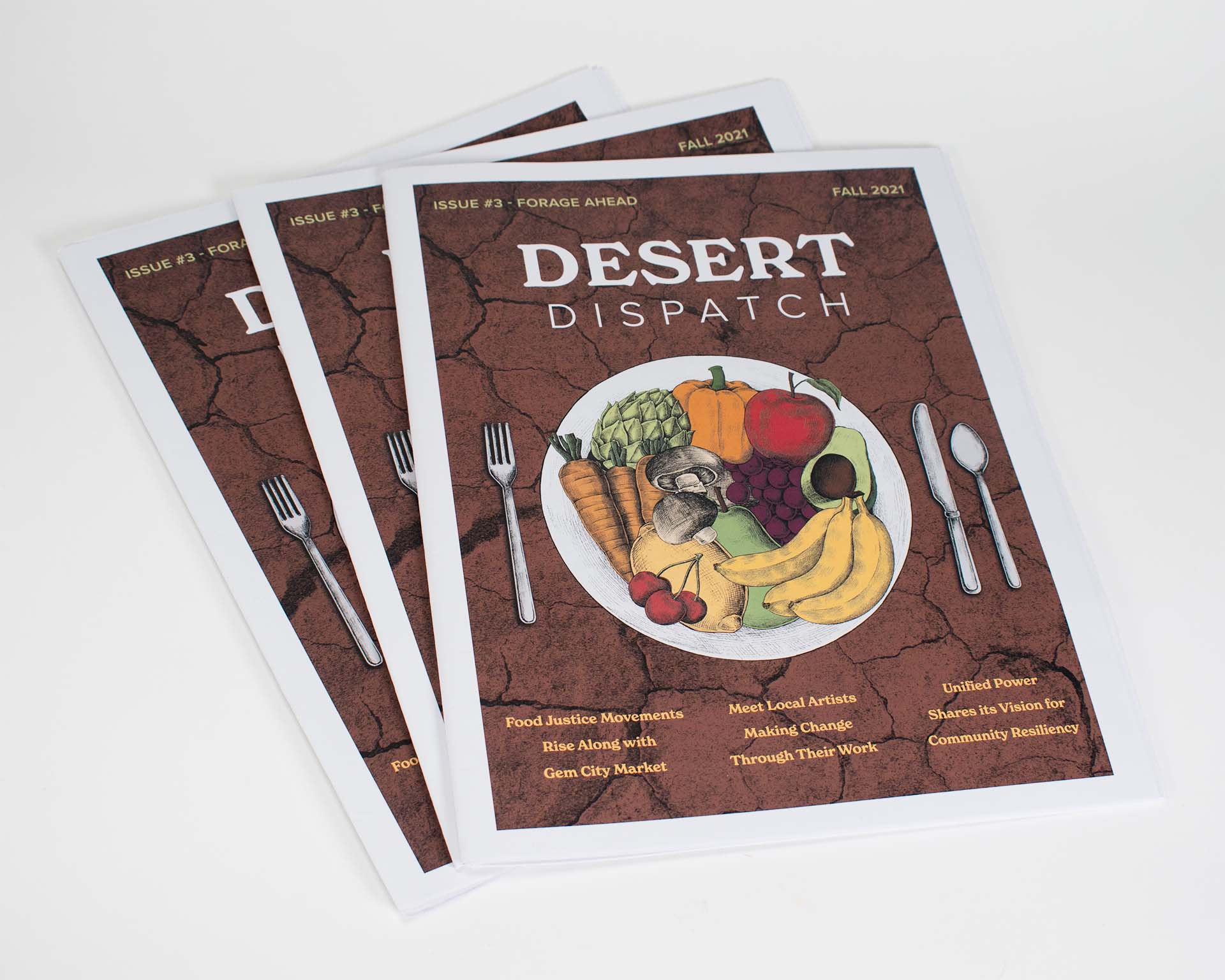
I designed the issue’s cover, front matter, and first twenty-three pages of content. In addition to my design duties, I also interviewed a local non-profit founder and wrote an article on her organization. To begin, my project partner and I established a detailed set of design standards to ensure our work would have a unified look. We explored typefaces, collaborated on a color palette, and found a set of illustrations that would be used throughout the issue. Setting these early standards made our workflow efficient.
This project required flexibility and attention to detail. Our content came from a number of different writers and photographers and staying on schedule was crucial to meeting our delivery date. The final piece was tabloid size and was printed Swiss Army style with Issue #2, which was shelved in 2020 during quarantine. The double issue was sold for a $20 donation.
This project required flexibility and attention to detail. Our content came from a number of different writers and photographers and staying on schedule was crucial to meeting our delivery date. The final piece was tabloid size and was printed Swiss Army style with Issue #2, which was shelved in 2020 during quarantine. The double issue was sold for a $20 donation.
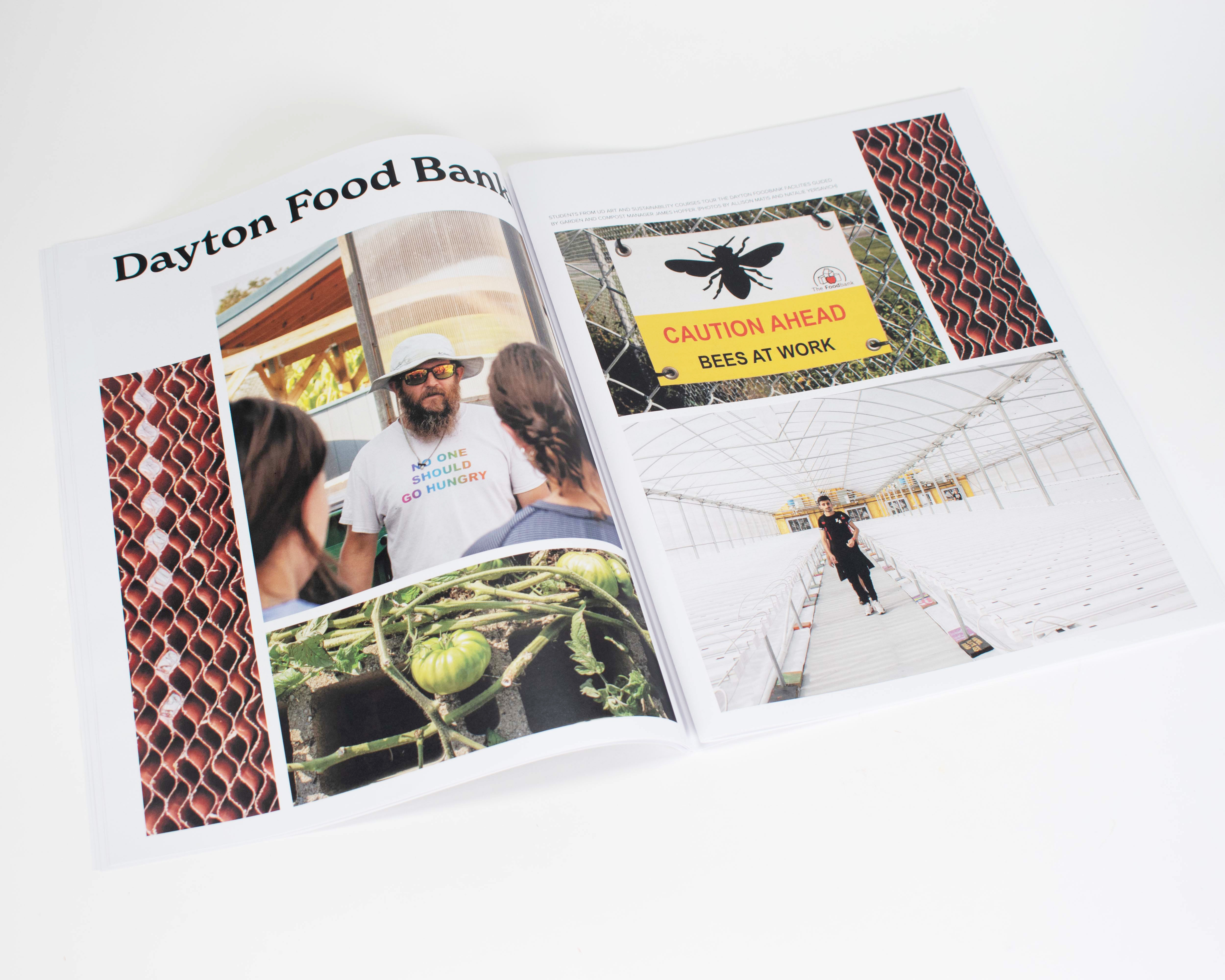
A spread of photography from a visit to the Dayton Food Bank.
 Desert Dispatch feature on Mission of Mary co-op member Matty Spicer.
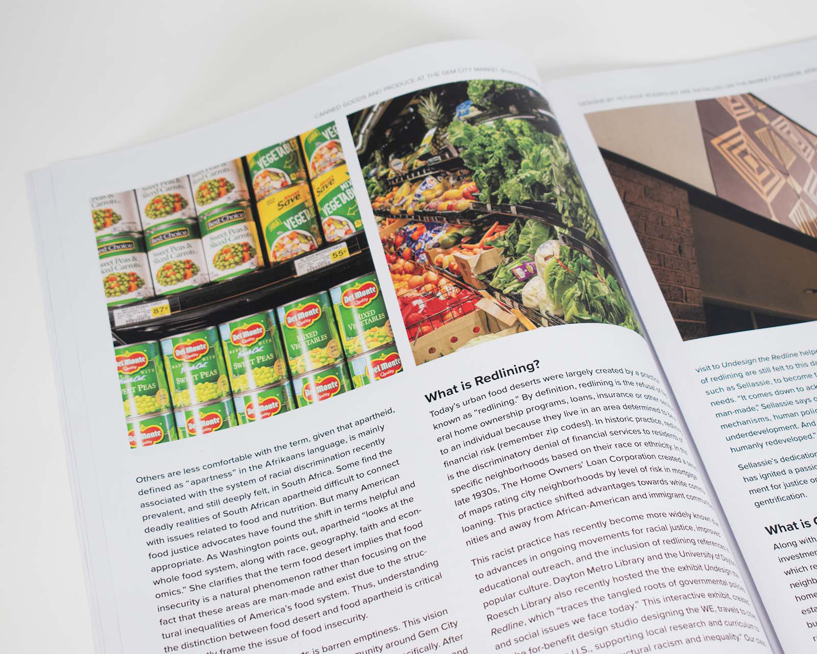 Details from the Desert Dispatch cover story.
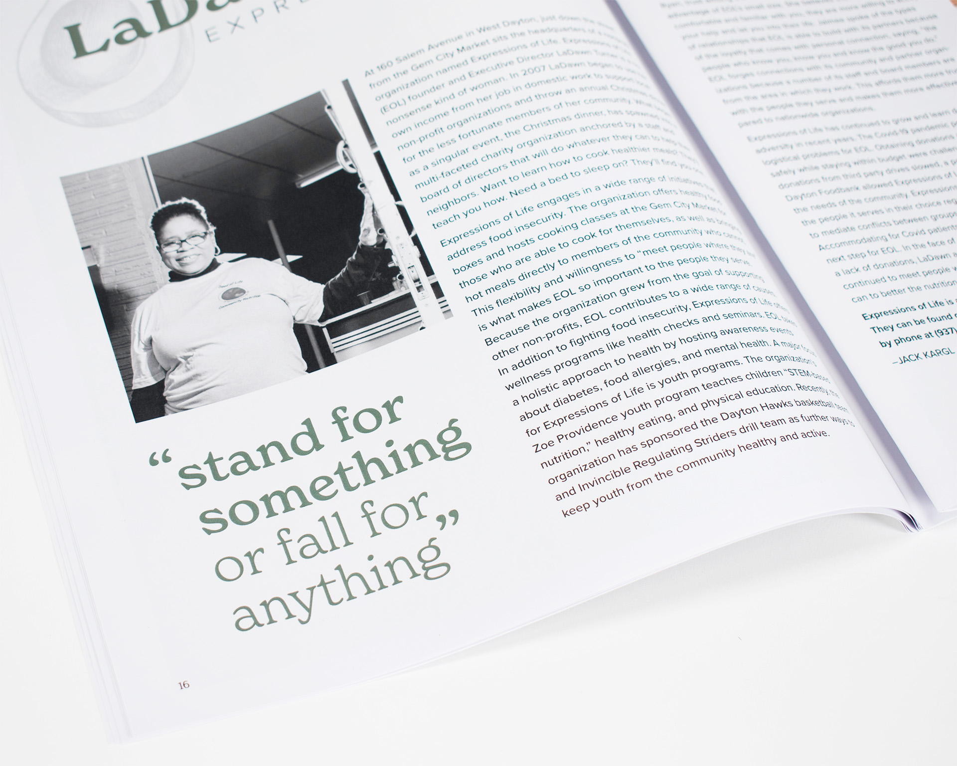
A pull quote from my interview with Expressions of Life founder LaDawn Turner.
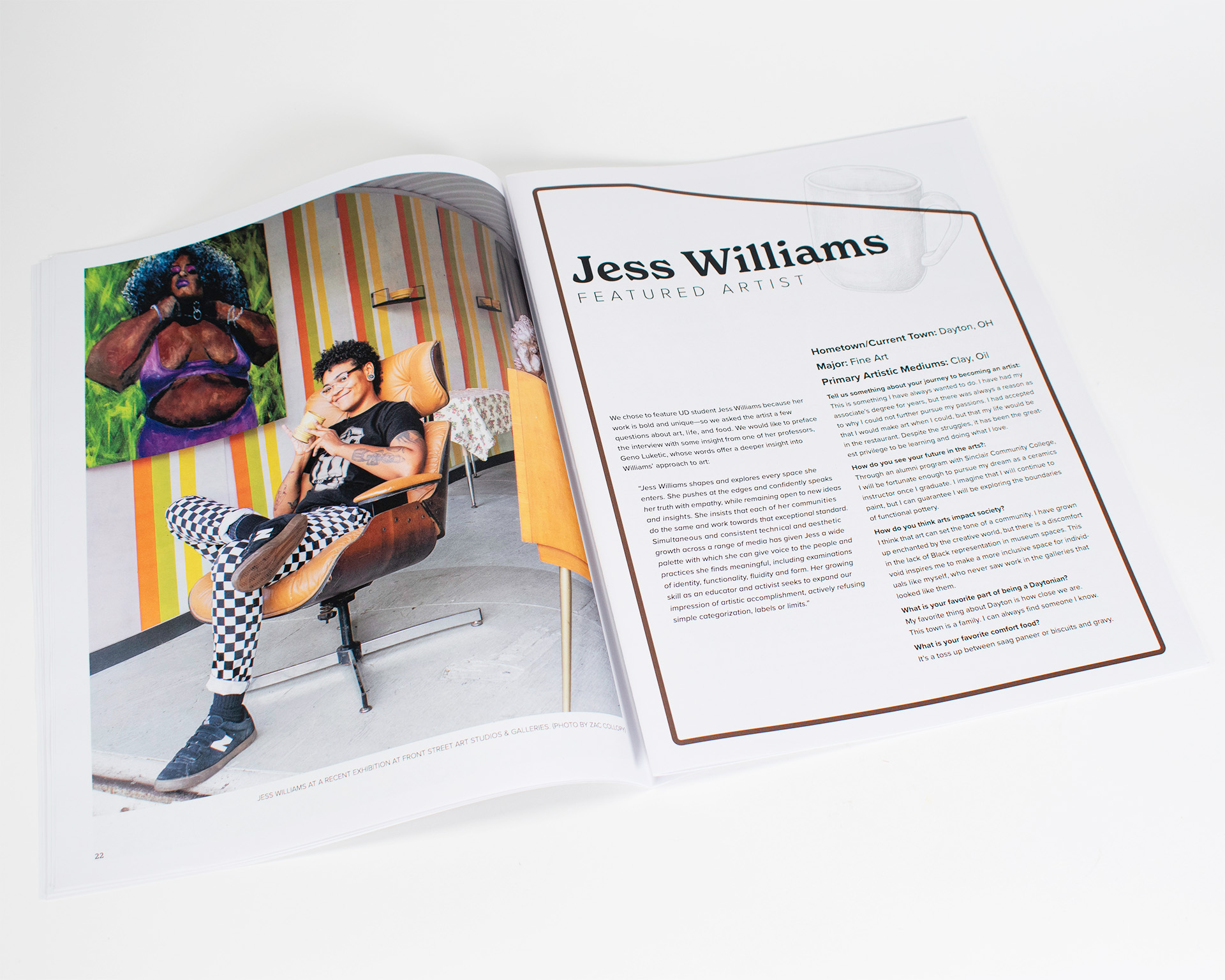
Profile of local artist Jess Williams.
The Designers of
Herman Miller
Book
Publication Design
The Designers of Herman Miller book cover featuring a photo of the company’s office in Zeeland, Michigan.
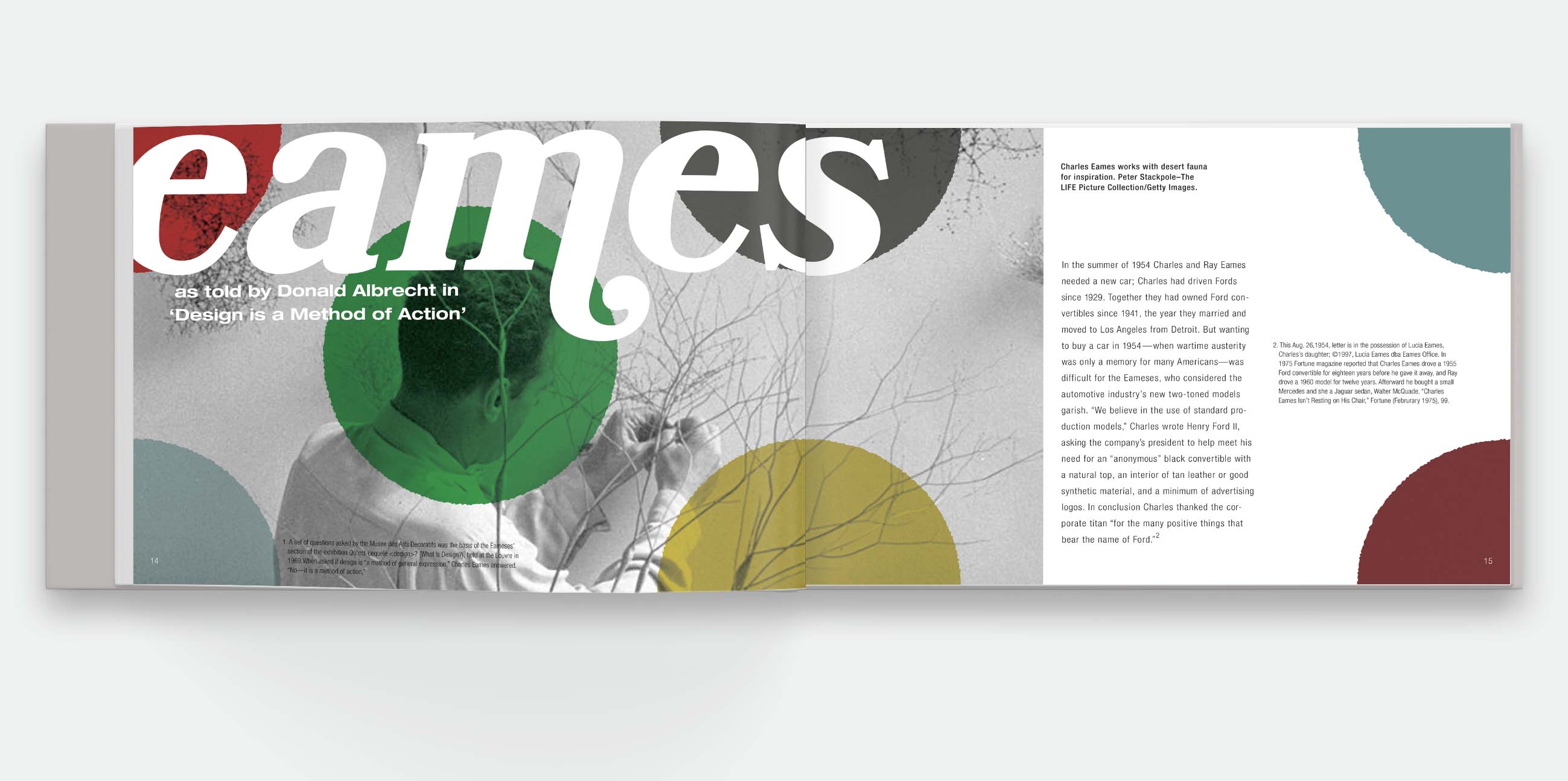
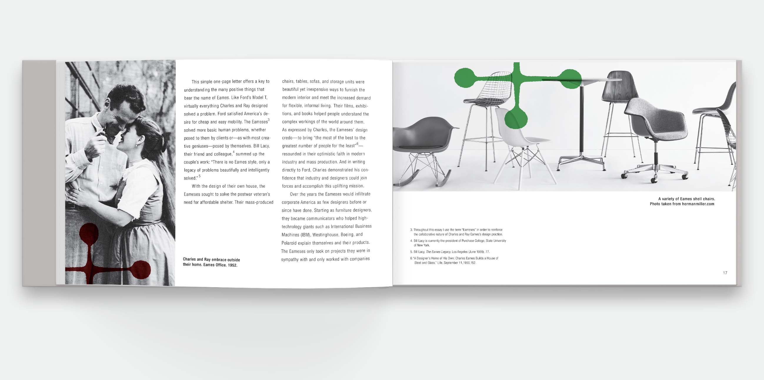
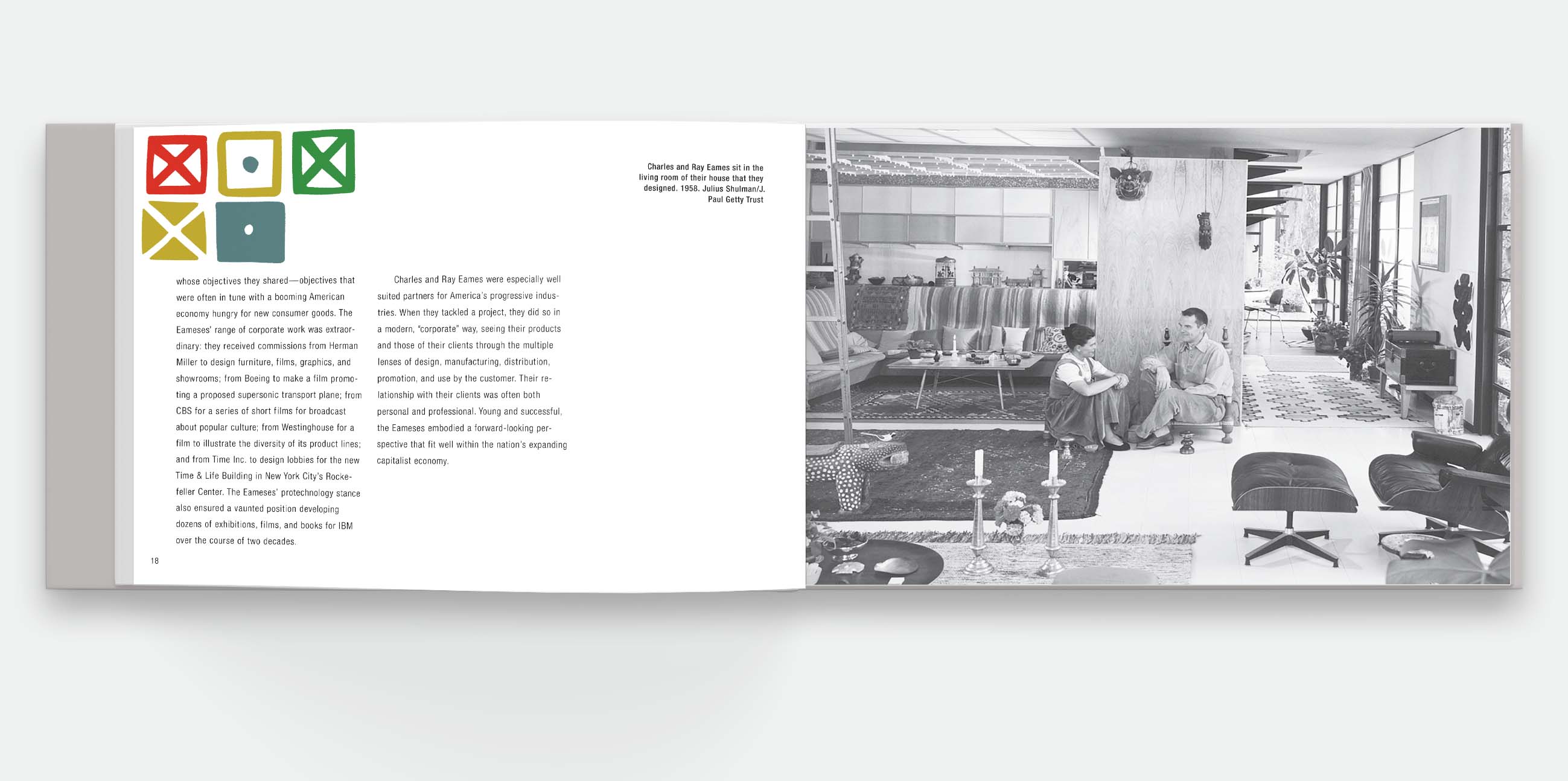
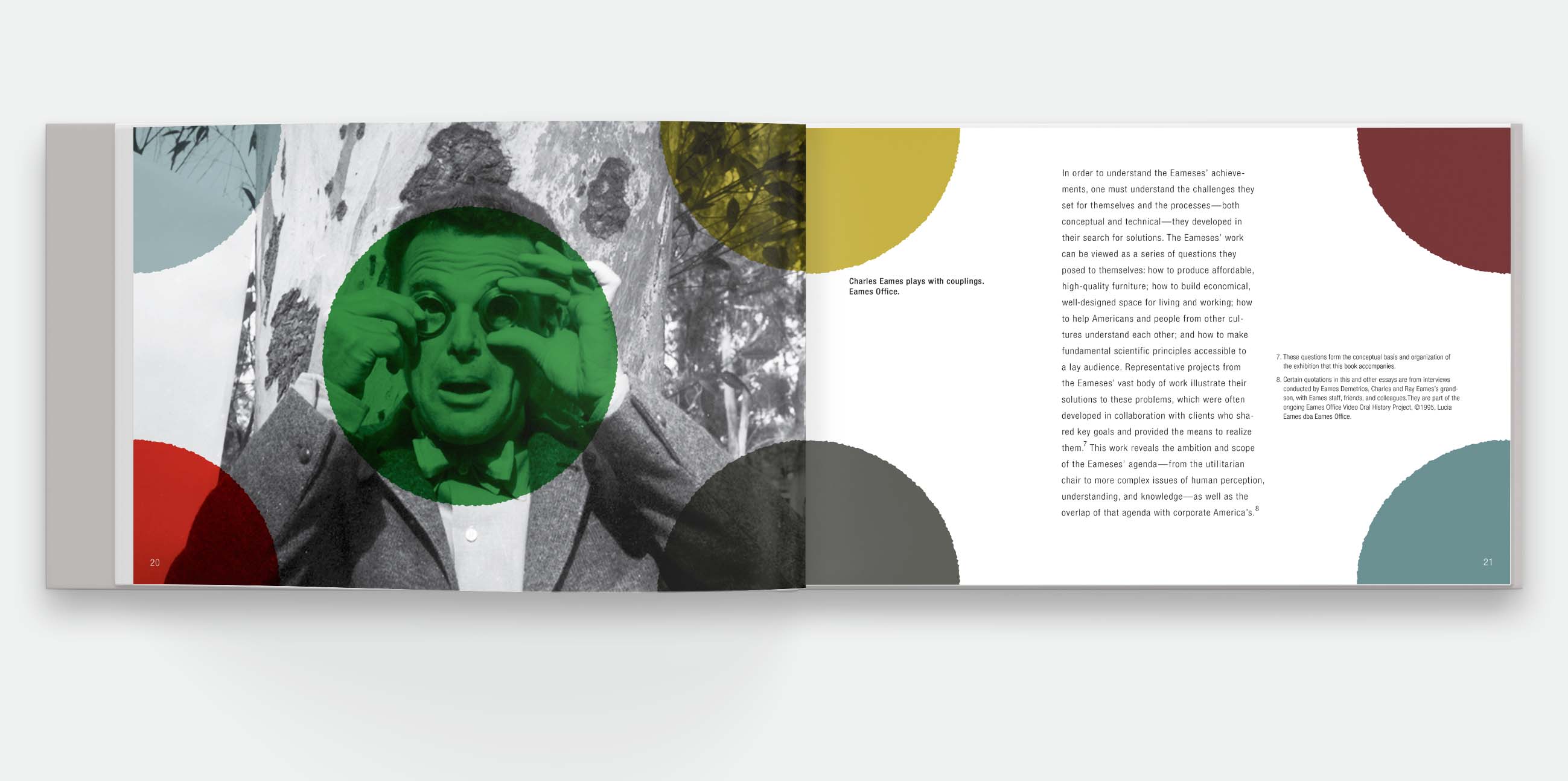
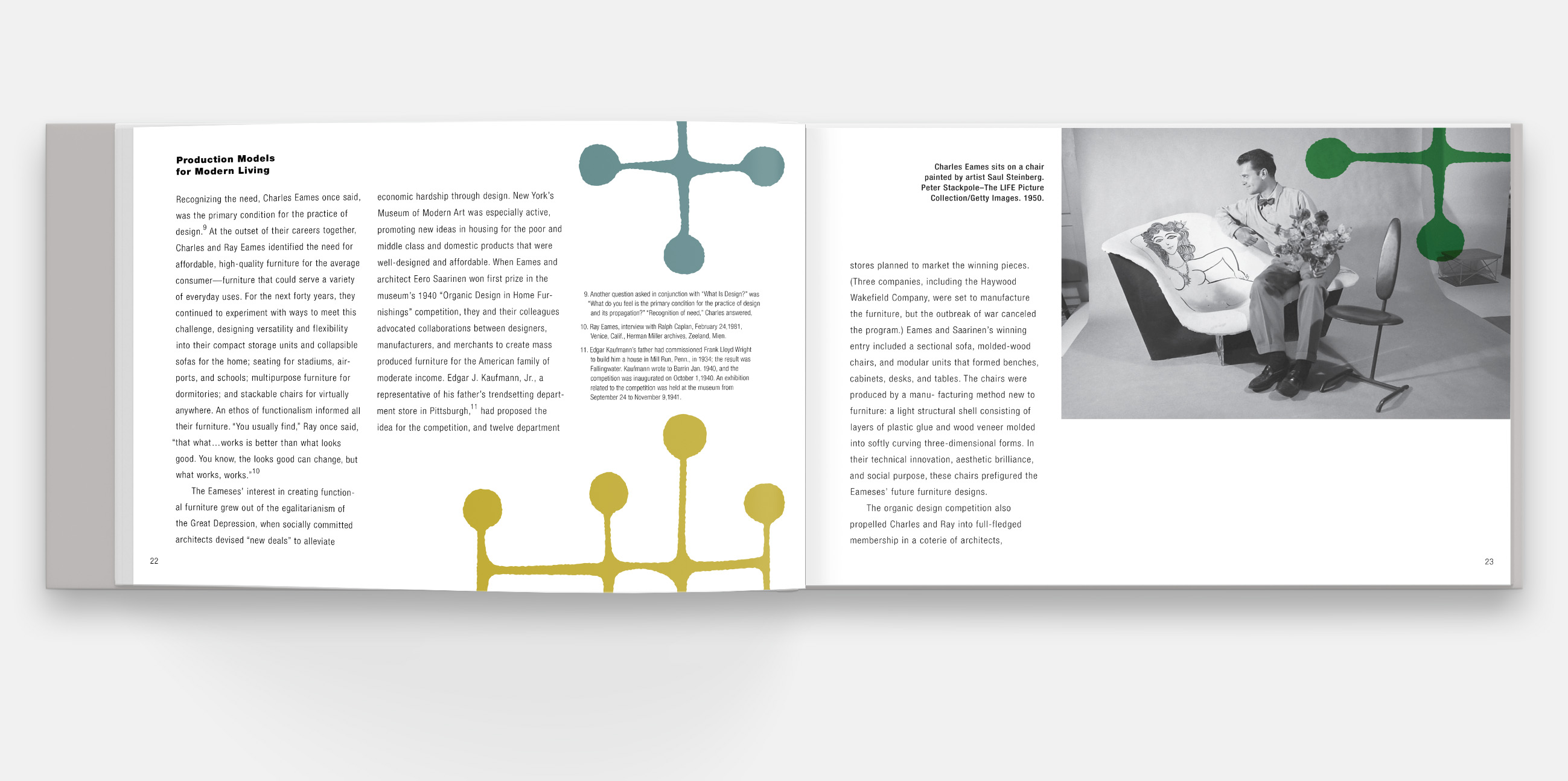
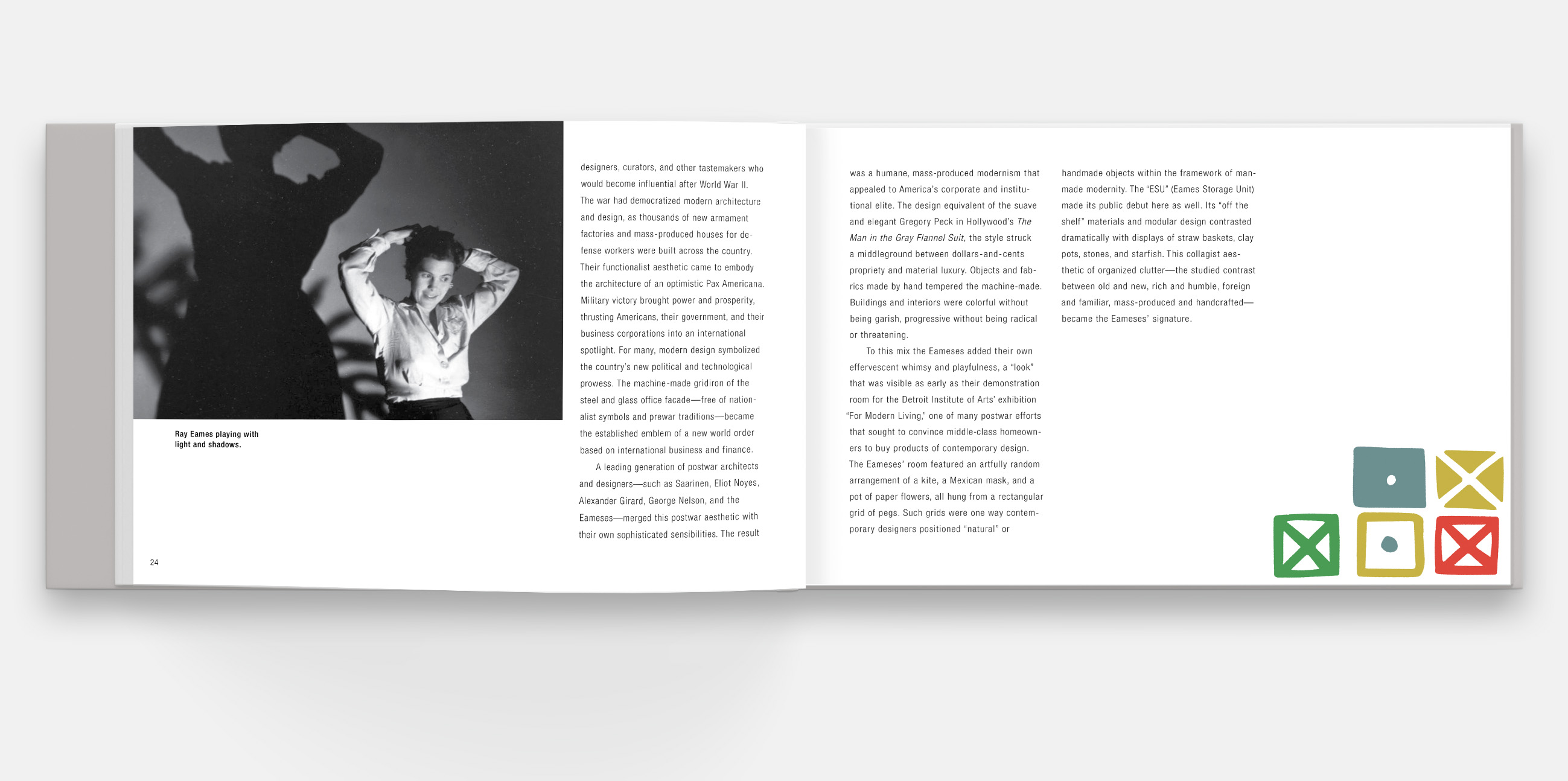
In order to celebrate the influential design company Herman Miller, I proposed a book that showcases each designer in the context of their contributions. Each chapter would use imagery borrowed from the individual’s work as graphic treatments placed across spreads. This concept is explored in practice using the work of Charles and Rae Eames.
The Eames section of the book begins with a bold wordmark. Each spread in the section features patterns created by Rae Eames. These textile patterns were invaluble to the company’s mid-century modern aesthetic. The patterns weave through the text, break off the page, and multiply into the background, making them an active contrast to the black and white photography featured.
Click through the gallery below to see the six Eames spreads.
